Copyright: CC0 1.0
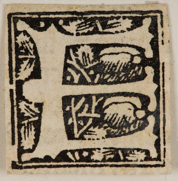
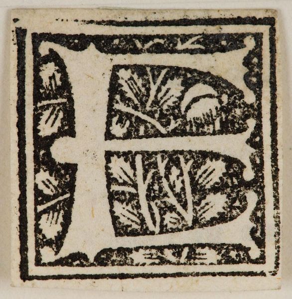
Editor: This is Initial F, by an anonymous artist. The black ink against the off-white paper creates a stark contrast. I am intrigued by the figure-ground relationship here. What do you make of this print? Curator: Observe how the rigid geometry of the letterform contrasts with the organic infill. Note the carefully balanced positive and negative spaces; the artist has created a dynamic tension. Does this suggest anything to you? Editor: It emphasizes the form of the letter itself, perhaps? Curator: Precisely. The letter "F" becomes more than just a letter; it's a study in contrasts, a balance of opposing forces, contained within a rigid structure. Editor: I hadn't thought about it that way. I see so much more now! Curator: Paying attention to details reveals much about artistic intentions.
Comments
No comments
Be the first to comment and join the conversation on the ultimate creative platform.
More like this