drawing, collage, watercolor, pen
#
drawing
#
collage
#
narrative-art
#
caricature
#
war
#
bird
#
soviet-nonconformist-art
#
figuration
#
watercolor
#
coloured pencil
#
naive art
#
pen
#
mixed media
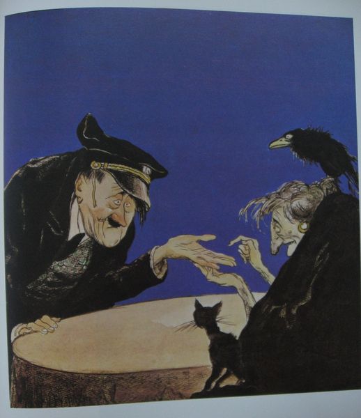
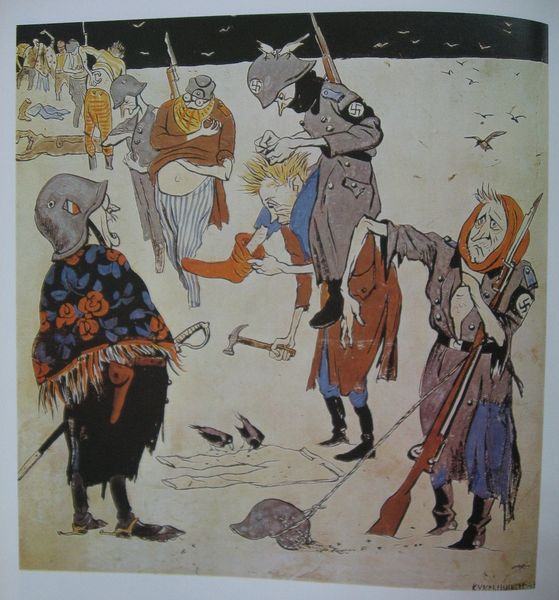
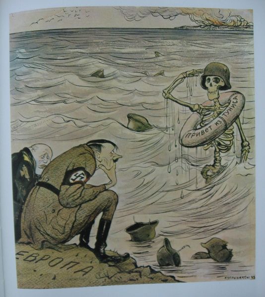
Copyright: Kukryniksy,Fair Use
Kukryniksy made this work, titled 'Where we should better land?', sometime between 1924 and 1957. It’s got this hand-drawn, cartoonish feel, with thin washes of color laid over the top of hard black lines, and a palette that's muted but still manages to be punchy. You can tell they weren't aiming for photorealism. Instead, it's all about the gesture, the quick sketch, and capturing the attitude more than the accurate detail. I'm drawn to the way they handle the ink, how it bleeds a little on the page. There's this real sense of immediacy, of getting the idea down quick before it fades. Look at the way they suggest the sea and rain with just a few confident strokes. It’s interesting how some of the forms are left open ended, dissolving into the background, encouraging the viewer to fill in the gaps. It reminds me of some of Philip Guston’s later political cartoons. Both artists use humor and exaggeration to make serious points, using simplified forms to amplify the message. Ultimately, a piece like this reminds us that art doesn't always have to be polished or perfect to be powerful.
Comments
No comments
Be the first to comment and join the conversation on the ultimate creative platform.
More like this