drawing, print, engraving
#
drawing
#
baroque
#
pen drawing
# print
#
pen illustration
#
pen sketch
#
old engraving style
#
cityscape
#
engraving
Dimensions: height 163 mm, width 209 mm
Copyright: Rijks Museum: Open Domain
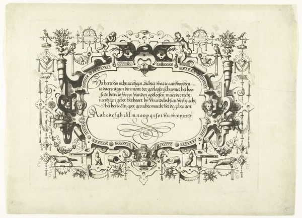
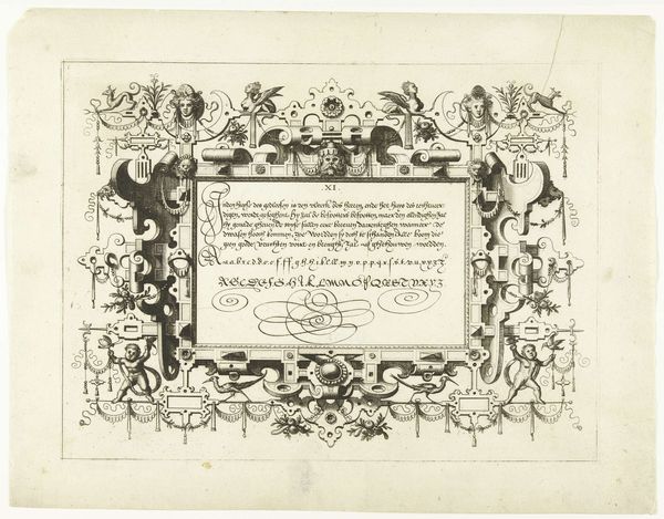
Curator: Allow me to introduce "Titelpagina voor Lucas Fopsz Lely, Jeughts nutlijck A.B.C.," created in 1621 by Gerrit Gauw. It's a beautiful example of Baroque engraving. Editor: Baroque, yes, but also so…packed. Like a little visual encyclopedia, teeming with characters and cityscapes, all crammed together. My first thought is, wow, this artist really wanted to get their money's worth! Curator: It's a title page, after all, so it serves as a sort of advertisement. Note how it frames Lucas Fopsz Lely's name within emblematic city views of Amsterdam and Hoorn. The cities act as testaments of reputation, announcing its geographical reach across Holland. Editor: Oh, so it's like a visual CV! Clever. The Amsterdam side, especially, looks so lively with those little boats on the water. I also love how the seated figures with books are mirrored, balanced by the garland draped underneath. The caduceus gives an almost "medical" feeling, and the contrast between the figures in motion versus those engrossed in study is very interesting. Curator: Indeed! And the caduceus may be a sign that he studied abroad, or at the very least it alludes to intellectual wealth. These carefully constructed scenes are visual arguments for the school's merits: commerce and classical erudition made newly accessible in the vernacular Dutch. Editor: You're right, those cityscapes really root it in a specific time and place, and highlight the significance of local language in this historical moment. I bet people recognized the skyline of Amsterdam immediately back then. That level of detail in an engraving! Amazing. Curator: It emphasizes that while rooted in Amsterdam’s prosperity, this educational mission expands outward. Note, finally, the artist's tiny signature bottom-left— a statement of pride and accomplishment, as much as a declaration of authorship. Editor: Yes! The engraving style is incredible; I love these details and how they contribute to the composition, while remaining in the periphery, giving us clues. Thank you, it made me see the work in another way. Curator: The pleasure was all mine! Each element sings in concert when one tunes their attention appropriately.
Comments
No comments
Be the first to comment and join the conversation on the ultimate creative platform.
More like this