drawing, paper, ink
drawing
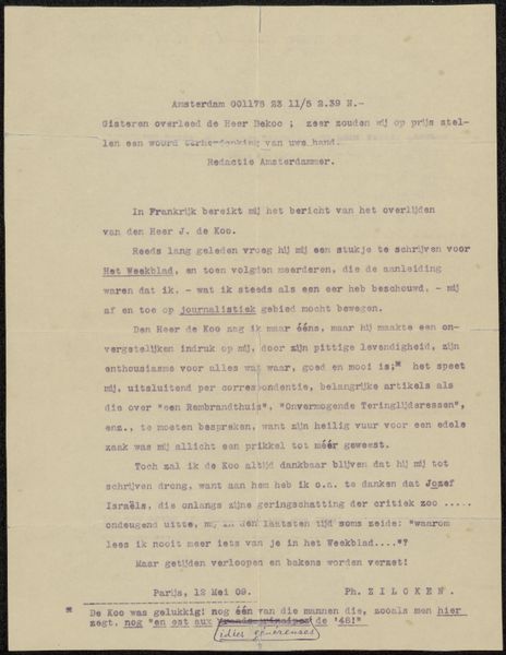
script typography
paper
ink
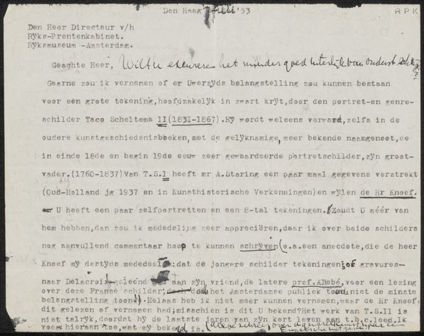
Copyright: Rijks Museum: Open Domain
Curator: This artwork, “Brief aan Philip Zilcken,” created before 1928, is comprised of ink on paper. I find myself captivated by its intimate scale and the immediate impression of personal communication. What draws your eye? Editor: Well, the script is so dense. I find it hard to read, but the swirling strokes of the handwriting have a life of their own. It makes me wonder about the relationship between the writer and the recipient. How do you interpret this work beyond just seeing it as a letter? Curator: I appreciate your observation about the script. It indeed forms a visual texture as compelling as its textual meaning. Notice the varying pressure and rhythm in the inking – thick strokes giving way to hairlines. This creates a dynamism across the page, transforming a simple message into an exercise of aesthetics. I see it as a balance between intention and raw feeling. Editor: So you are seeing beyond the text into something more expressive of form and shape. The strokes becoming, as it were, art! How would it look without that flourish at the top? I wonder if that were a signature. Curator: Precisely. This flourish serves not just as identification but enhances the aesthetic qualities. It provides an asymmetrical balance to the composition. What strikes me further is how, within this epistolary form, the materiality of the ink and paper elevates the communication into art object, quite beyond a simple transmission of language. What did you glean that changed your perspective? Editor: I will now look for the artistic elements of handwriting in other historical documents and letters. Thank you. Curator: Indeed. Thank you for opening my eyes as well.
Comments
No comments
Be the first to comment and join the conversation on the ultimate creative platform.