graphic-art, print, paper, typography
#
graphic-art
#
sand serif
#
script typography
#
hand-lettering
# print
#
typeface
#
editorial typography
#
hand drawn type
#
hand lettering
#
paper
#
typography
#
hand-drawn typeface
#
thick font
#
handwritten font
Copyright: Rijks Museum: Open Domain
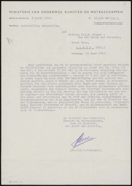
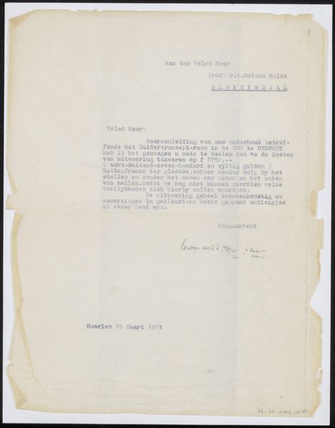
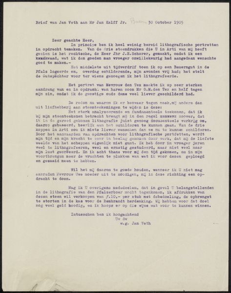
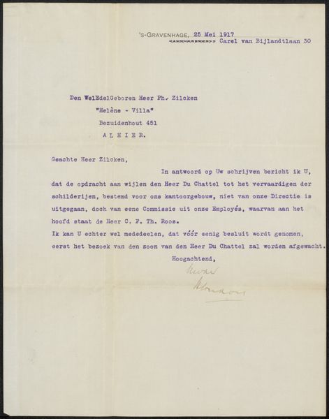
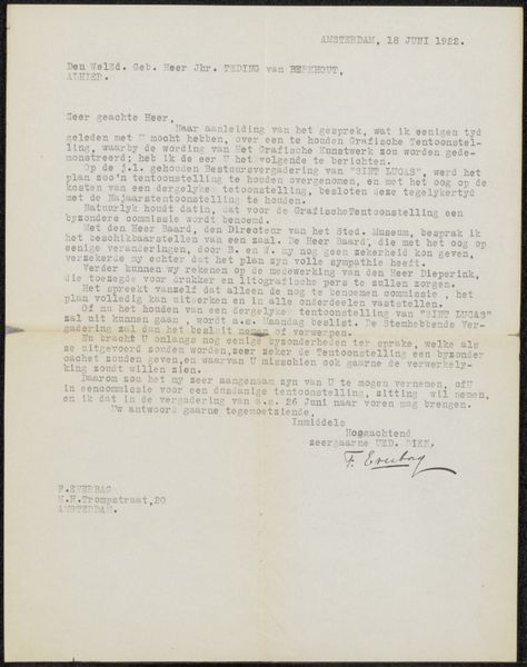
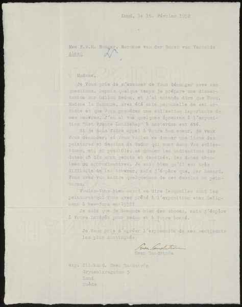
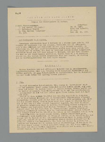
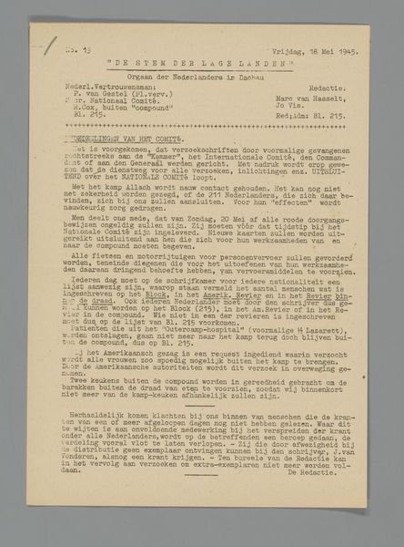
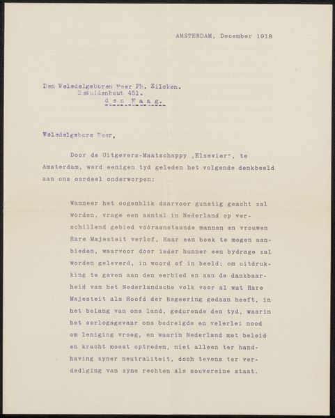
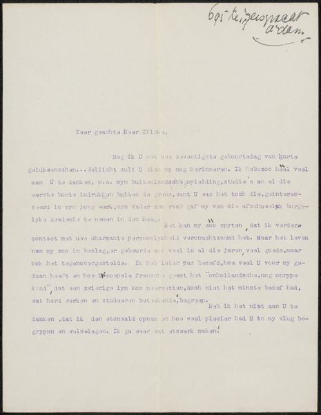
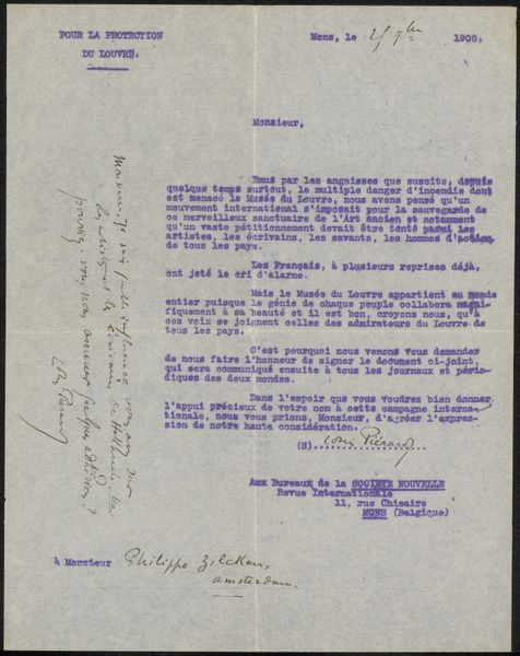
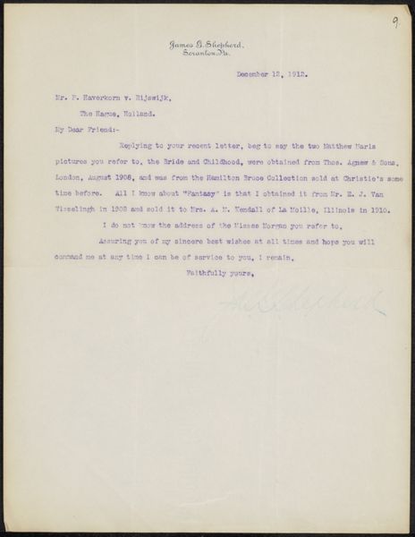
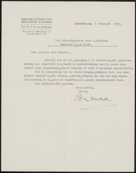
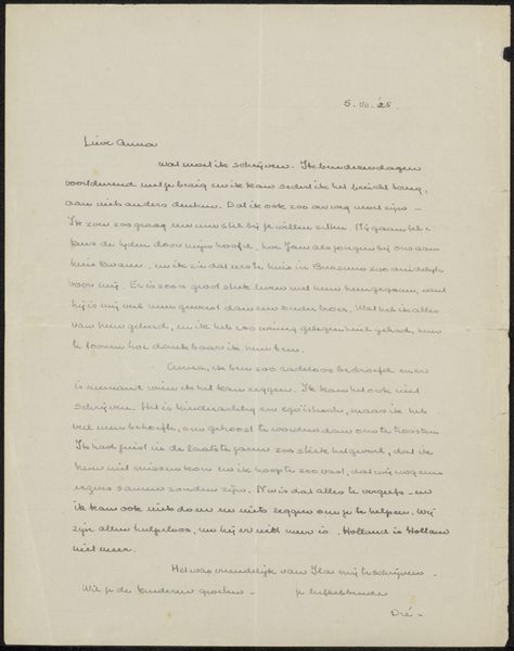
This is a letter from P.N. van Kampen & Zoon, dated September 6, 1918, made with ink on paper. The composition is defined by the rigid structure of the typed text, organized into neat paragraphs. This geometric layout is disrupted only by the handwritten salutation and signature at the top and bottom right, which introduce organic elements into the otherwise ordered design. The texture of the paper, visible in the high-resolution image, suggests a material quality that contrasts with the immateriality of the textual content. The letter engages with the semiotic interplay between text and context. As the text is a formal business communication, its visual presentation is equally significant. The letter format reflects the hierarchical and structured nature of early 20th-century business correspondence. It's not merely the information conveyed but also the cultural codes embedded within the font, spacing, and overall layout that communicate meaning. This piece challenges fixed meanings by presenting a blend of formal typography with personal, handwritten elements.
Comments
No comments
Be the first to comment and join the conversation on the ultimate creative platform.
