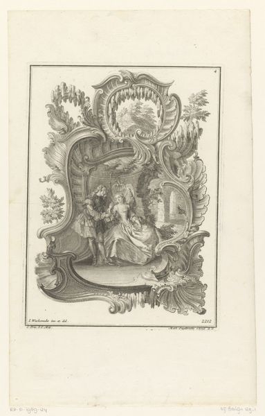
drawing, graphic-art, print, ink, engraving
#
drawing
#
graphic-art
#
baroque
# print
#
ink
#
pen-ink sketch
#
line
#
engraving
Dimensions: height 230 mm, width 198 mm, height 350 mm, width 268 mm
Copyright: Rijks Museum: Open Domain
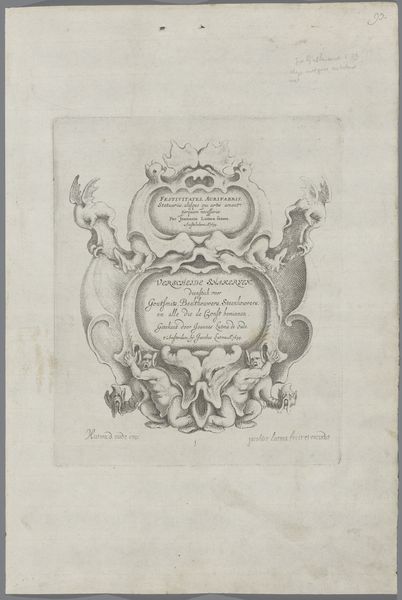
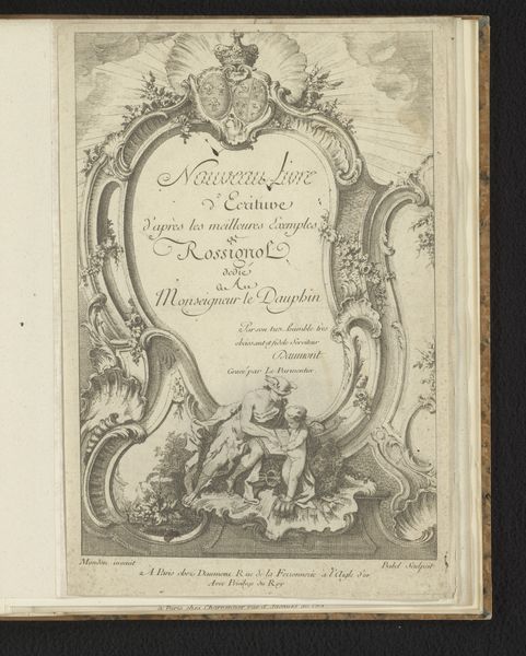
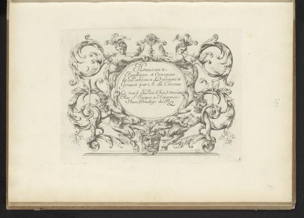
Curator: The piece we are observing is titled "Titelprent Second livre de cartouches" created circa 1710-1772 by Gabriel Huquier. It's a drawing, an engraving executed in ink. Editor: The immediate impression is theatrical, almost a stage design in monochrome. The line work is exquisite, a real study in controlled flourish. Curator: Indeed, the composition hinges on line and balance. Note the ornate frame—the meticulously rendered flora and the serpentine creatures create a container for the lettering within. Observe how the lines converge to draw the eye toward the central inscription. Editor: The frame is itself symbolic. These stylized leaves and figures create a visual language around the text, suggesting themes of creativity, perhaps royal patronage, or even the passage of time. Is that a dragon on the upper right, entwined with foliage? Curator: Precisely. Its presence, and the similar creature on the left, adds an element of the fantastic, common in Baroque art, even within something so functional as a title page. Consider how these beasts play into the larger structure of curves and counter-curves, offering dynamic balance. Editor: The lettering itself takes on a design quality, like a built artifact placed in the center—it uses fonts within fonts, hierarchy, and mirroring of certain lines in the surrounding decorations. And the suggestion of water at the bottom gives it weight. I wonder if it’s suggesting the very foundations of art itself? Curator: An intriguing thought. What’s striking is the interplay between the textual and the figurative. It’s not just decoration. Each element enhances the others. A very subtle use of structural counterpoint, wouldn't you agree? Editor: Absolutely. Even the slight imperfections in the paper itself, visible as subtle textural variations, contribute to the work’s overall visual texture. It's these contrasts—between control and organic imperfection—that give it life. A celebration of both form and inherent symbol. Curator: It’s been an enlightening discussion. Reflecting on the design through both formalism and iconographic symbol truly has uncovered subtleties easy to miss with one interpretive approach. Editor: Yes, I find I’m more drawn to the Baroque now that I've engaged its undercurrents and compositional complexities.
Comments
No comments
Be the first to comment and join the conversation on the ultimate creative platform.
More like this