graphic-art, print, typography
#
graphic-art
# print
#
asian-art
#
typography
#
geometric
#
watercolor
#
monochrome
Dimensions: height 225 mm, width 152 mm
Copyright: Rijks Museum: Open Domain
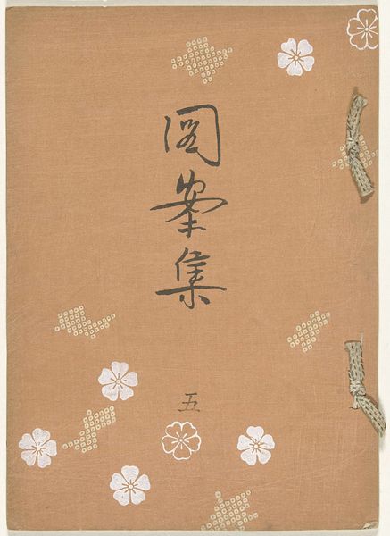
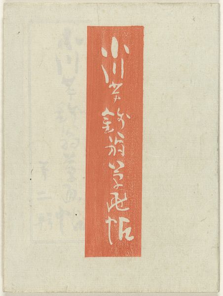
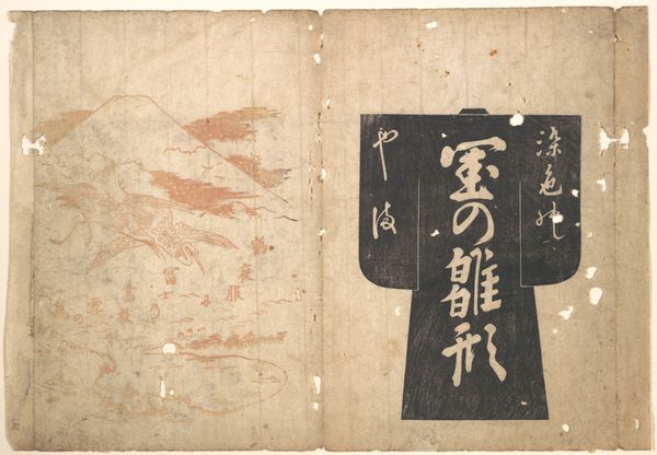
Curator: Well, hello there. Let's turn our attention to a rather intriguing print, "Juli 1905 - speciale editie", which loosely translates to "July 1905 - Special Edition." It was made somewhere between 1905 and 1907, and it’s an example of graphic art featuring typography. Editor: Immediately, it strikes me as incredibly serene. The muted color palette, almost entirely monochrome, lends this sense of quiet contemplation. There’s something almost meditative about the geometric shapes and lines; it’s simple but very powerful. Curator: Absolutely. And in this context, we’re thinking about the ways print media was evolving. This artwork really speaks to the increasing integration of Western design principles into Japanese art and visual culture, influenced by art nouveau and even constructivist approaches. Think about the role that these kinds of graphic works played in shaping public opinion and visual literacy at the time. Editor: It is fascinating to consider how this seemingly simple design might have carried so much cultural weight. It also kind of brings to mind an abstract human figure… the vertical line punctuated by shapes… but that might be my own weird associations. Curator: Not weird at all! Interpretation is welcome, of course. And it’s important to consider the artist, Nakamura Fusetsu, who played a key role in this East-meets-West aesthetic dialogue. Fusetsu worked during a period of intense modernization and Westernization in Japan, where many artists were exploring how to balance tradition with modernity. He successfully combines this geometric minimalism with traditional cultural forms. Editor: Thinking about this piece, I can't help but reflect on how even something seemingly simple can hold within it these cross currents of different worlds, traditions and ideas. I really love that idea. Curator: Me too, actually. Seeing how an image so simple on the surface carries so much depth really puts me in my place and in time.
Comments
No comments
Be the first to comment and join the conversation on the ultimate creative platform.
More like this