Inhougsopgave voor: De Standvastige Monarchye des Doods, ca. 1707-1708 1707 - 1708
0:00
0:00
abrahamallard
Rijksmuseum
print, paper, typography
#
baroque
# print
#
paper
#
typography
#
coloured pencil
#
genre-painting
Dimensions: height 315 mm, width 200 mm
Copyright: Rijks Museum: Open Domain
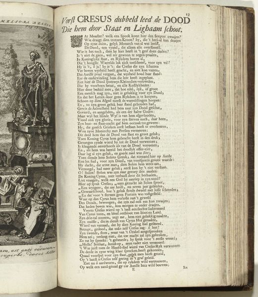
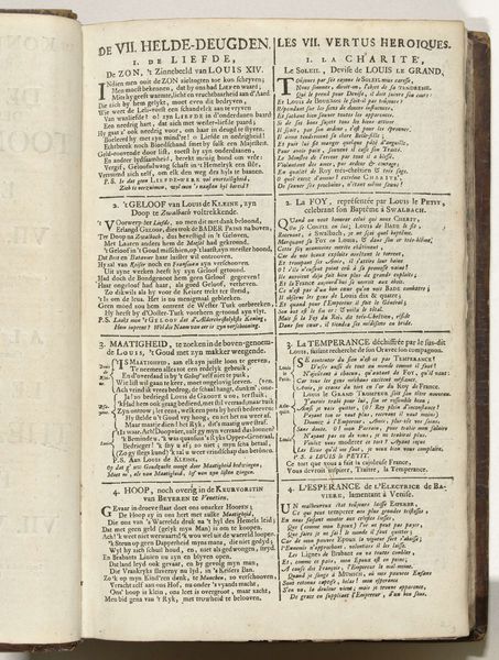
This is a page from "Inhougsopgave voor: De Standvastige Monarchye des Doods," printed around 1707-1708 by Abraham Allard. Look closely, you’ll see it’s made of paper, printed with ink using a printing press, a technology that was revolutionary for its time. Printing was a complex process, demanding skilled typesetting, inking, and the operation of the press itself, a labor-intensive process reflecting the era's transition to mass production. The choice of typography, layout, and paper quality all contribute to the book's overall aesthetic and readability, reflecting the values and expectations of its intended audience. The inherent qualities of paper—its texture, weight, and ability to absorb ink—influenced the final appearance of the text and images. The contrast between the dark ink and the light paper creates a visual hierarchy, guiding the reader's eye and conveying meaning. The use of this relatively reproducible medium ties into social issues of labor, politics, and consumption during the early 18th century. The amount of work involved in the production process is a testament to the value placed on knowledge and communication. Recognizing the significance of materials, making, and context allows us to fully grasp the meaning of "Inhougsopgave," moving past the outdated distinctions between fine art and craft.
Comments
No comments
Be the first to comment and join the conversation on the ultimate creative platform.
More like this