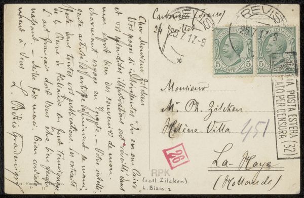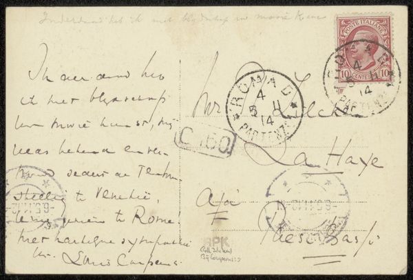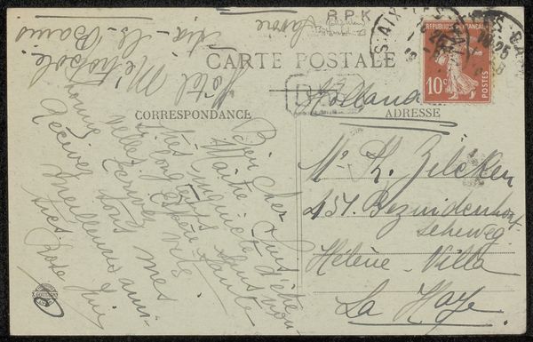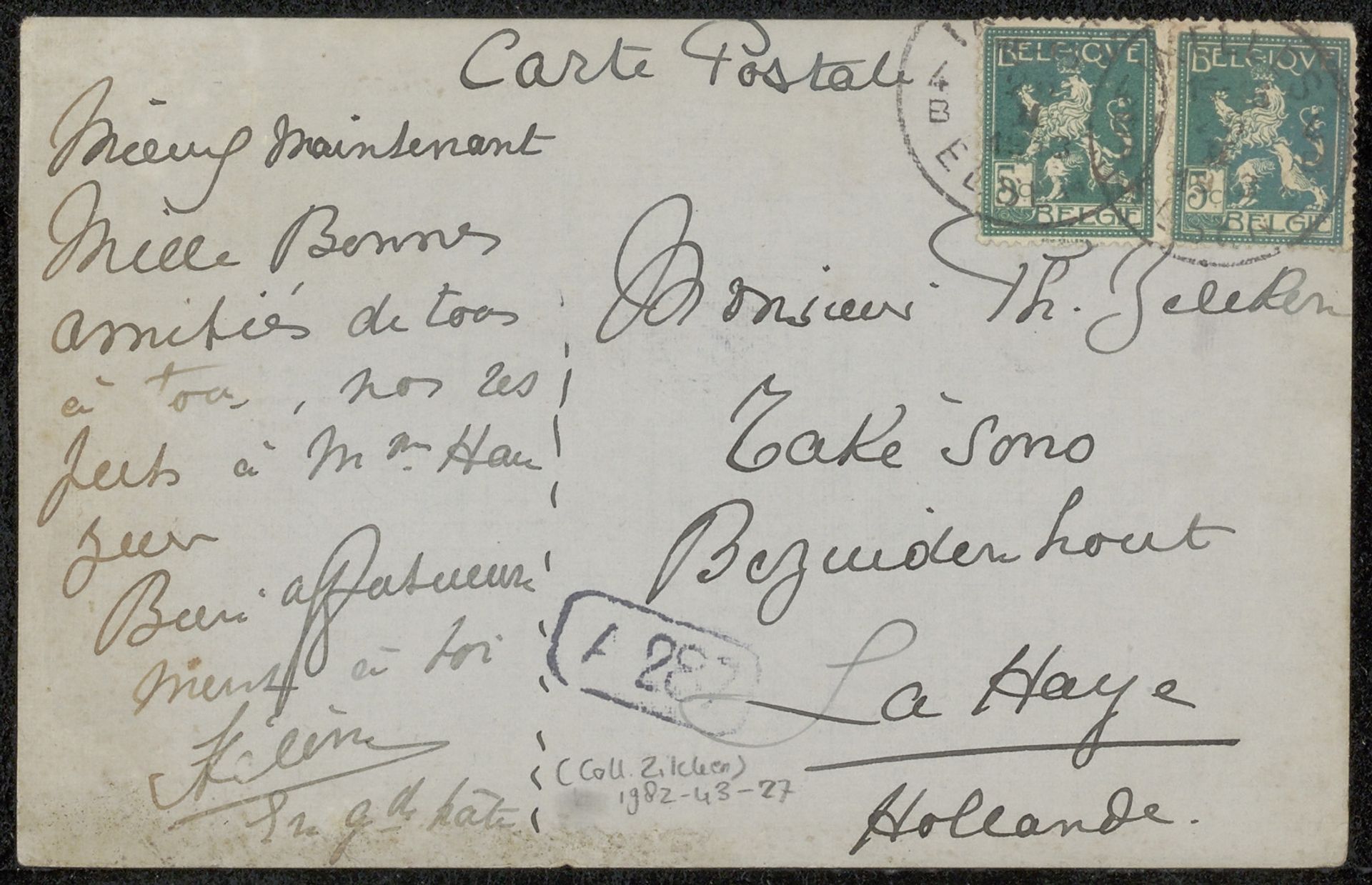
before 1913
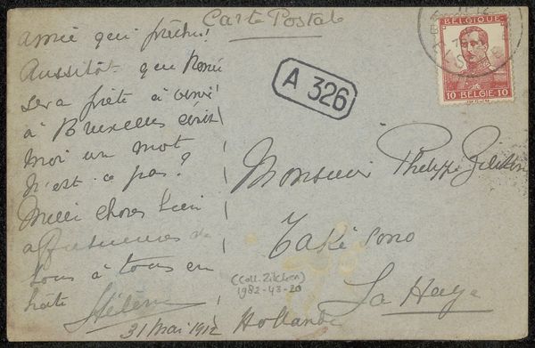
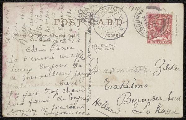
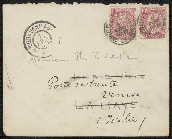
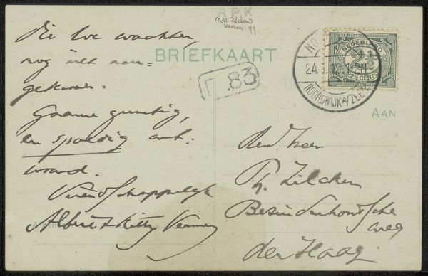
Brief aan Philip Zilcken
Listen to curator's interpretation
Curatorial notes
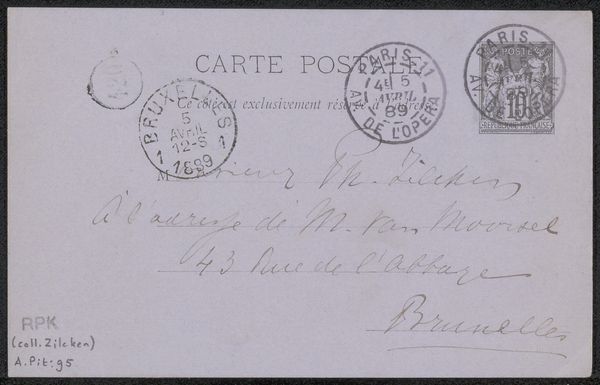
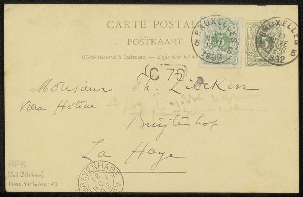
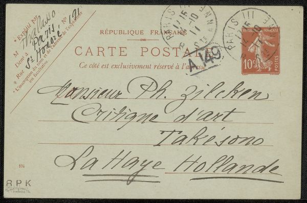
Curator: This is a letter, “Brief aan Philip Zilcken,” sent before 1913. It's rendered in ink on paper. What do you make of it initially? Editor: A flurry of script! The lines seem to dance across the surface. The penmanship itself possesses a certain dynamism; it’s lively, and gives me the impression of intimacy and quick exchange. Curator: I find it fascinating how handwriting, as a visual form, operates on several layers. We're immediately confronted by its purely graphic qualities - the contrast of the dark ink against the pale paper, the rhythm of the loops and ascenders. Beyond that, we have the coded meaning, the actual words being conveyed. Editor: Absolutely. The handwriting serves almost as a symbolic signature here; it conveys personality, perhaps even mood. This particular hand seems quite confident and fluid. I also noticed the postmarks and stamps, with the Belgian lion rampant; what of their heraldic importance? Curator: Observe the composition – how the writing almost completely fills the available space. The eye jumps around, finding anchors in the repeated curves and downstrokes. There is almost a claustrophobic sensibility when considering the limited blank area on this card. Editor: Precisely! Perhaps speaking to the writer's urgency, her need to fill the void of distance with words, or simply economical writing out of a constrained need. Consider also the language choices -- the warm greetings ("Mille bonnes amitiés") and the place names (“La Haye”, “Hollande”)…each carries its own weight of cultural memory. Curator: Let us not overlook the formal quality and weight, and contrast, produced by the consistent mark making here. It’s an important reminder that even everyday ephemera can offer rich visual textures. Editor: I agree entirely. It’s a glimpse into a personal exchange frozen in time, and a quiet testament to the human desire for connection. Curator: And through an artful union of line and language, the personal becomes imbued with the potential of meaning on multiple levels.