#
neo-pop
Copyright: Modern Artists: Artvee
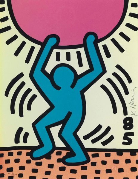
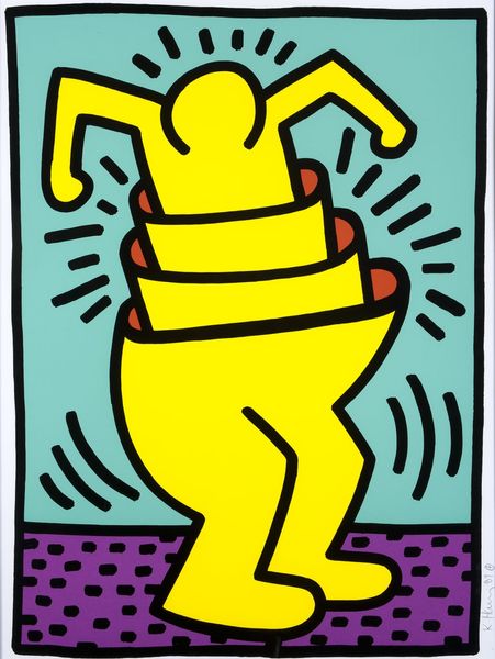
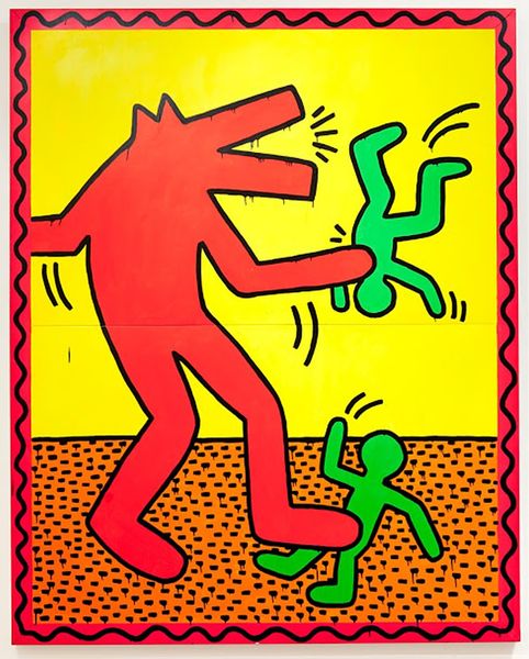
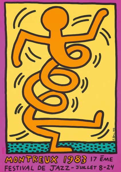
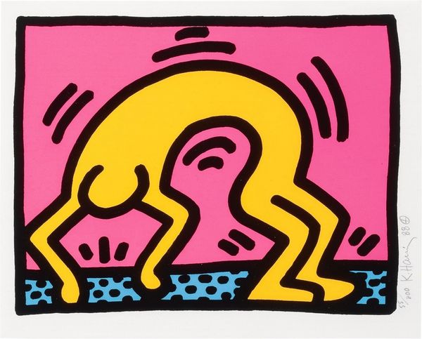
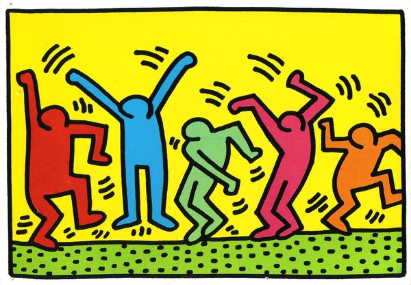
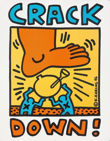
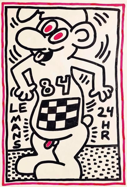
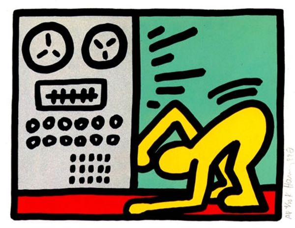
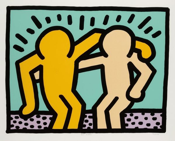
Keith Haring made this poster to advertise the World Breakdance Championship, probably using screen printing to get those bold, flat colours. It’s so immediate, right? You just look at it and feel energy. Haring’s all about speed and movement, like in those quick marks radiating from the dancer. They look like a big blur in the air, don’t they? And there’s this great yellow figure, kind of an every-person, with a clock for a head, bent into a classic breakdance pose. I like how the hard black outline just *pops* on the bubblegum pink backdrop. Those colours aren’t naturalistic, but they’re so alive together. The green dots in the background suggest a stage floor, but also a kind of psychedelic otherworld. Haring picked up so much from graffiti art, which really shows in his bold and accessible style. Like Basquiat, he brings an energy and urgency to his work. Even though he's not here anymore, he's still speaking to us.
Comments
No comments
Be the first to comment and join the conversation on the ultimate creative platform.
