drawing, mixed-media, paper, ink, pen
#
drawing
#
mixed-media
#
paper
#
ink
#
pen
Copyright: Rijks Museum: Open Domain
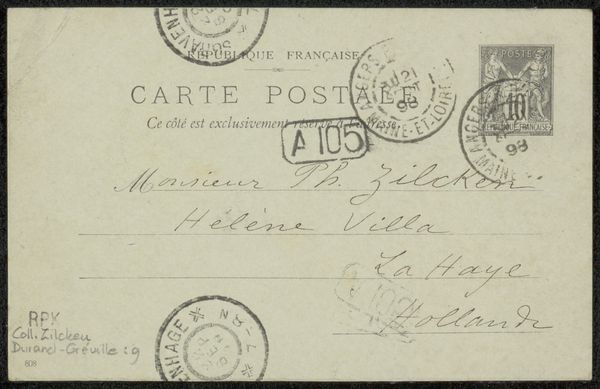
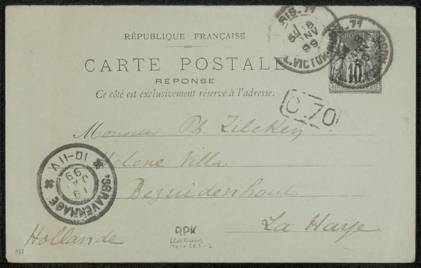
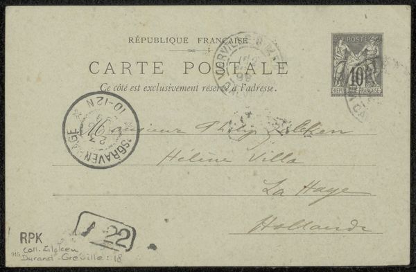
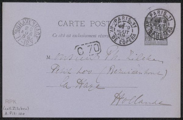
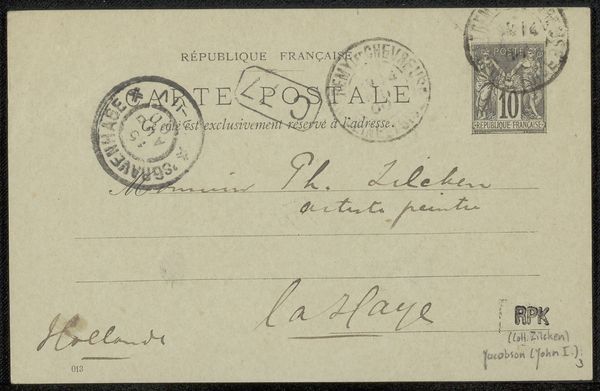
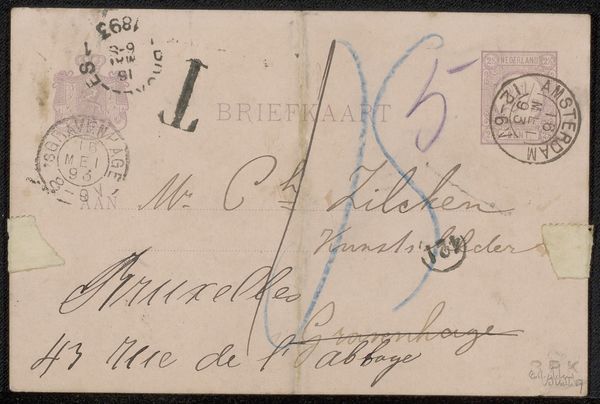
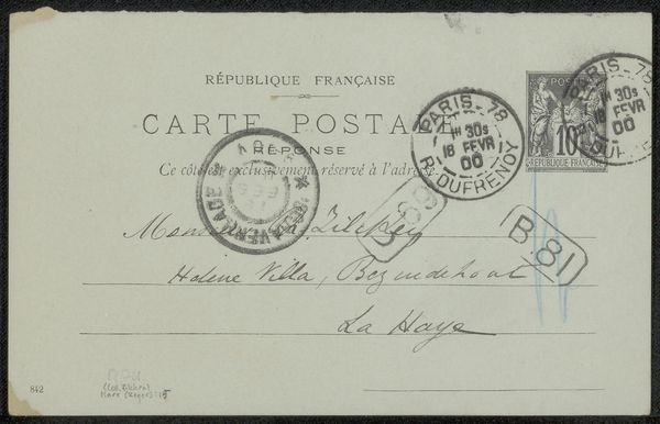
This postcard to Philip Zilcken, was made with ink on paper by Willy Martens. What grabs me first is the way the text is both carefully inscribed, yet smeared and disrupted by the various postal stamps. It’s a reminder that artmaking, like communication itself, is never a pristine act but is affected by chance and circumstance. The color palette is muted, almost monochromatic, giving the card a vintage feel. The ink varies in opacity, creating subtle shifts in tone and texture. The marks from the stamps and handwriting have a rhythmic quality, like musical notation. Look at the way the address curves and flows, like a gesture or a dance across the page. The postal stamps are a really interesting detail, they punctuate the composition. This reminds me of the work of Cy Twombly, whose loose and gestural marks echo the messiness of everyday life, where nothing is ever fully fixed or defined. Art, like a postcard, is an open invitation to multiple readings and interpretations.
Comments
No comments
Be the first to comment and join the conversation on the ultimate creative platform.
More like this