Copyright: CC0 1.0
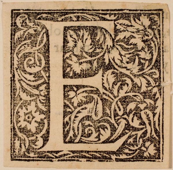
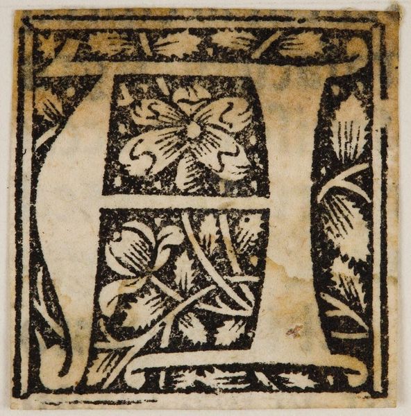
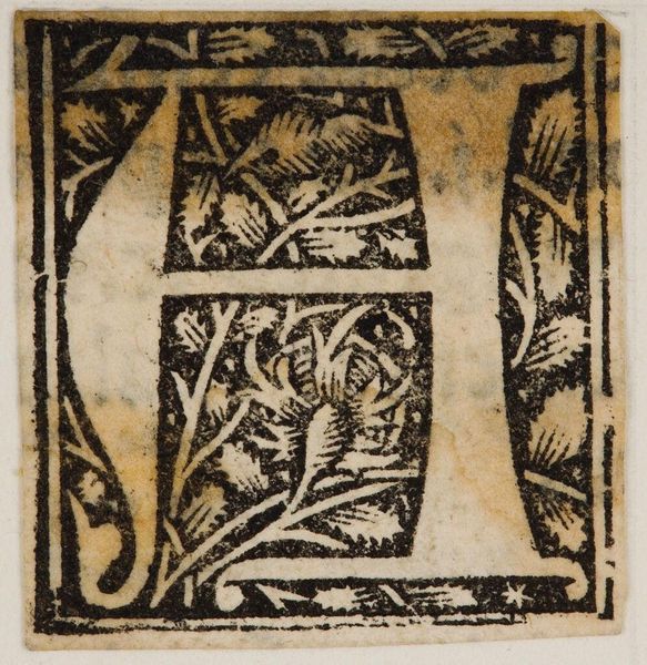
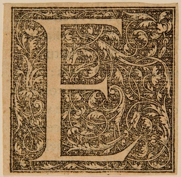
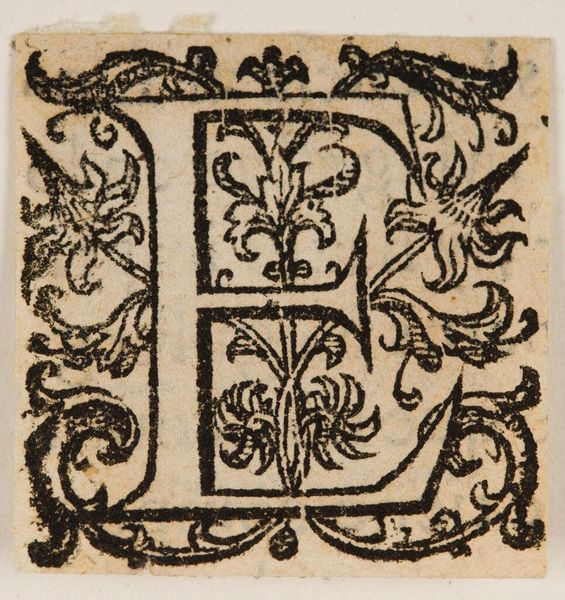
Editor: This is an anonymous piece called "Letter E," housed in the Harvard Art Museums. It's graphic and intricate, like a page from an old manuscript. What strikes you about its composition? Curator: The stark contrast between the black ink and the lighter substrate immediately grabs attention. Note how the letter itself provides structure, a rigid frame for the organic, curvilinear forms within. Editor: So you see the letter as a foundation for the flourishing details? Curator: Precisely. The negative space is just as crucial. The dotted field infuses the design with a sense of depth and texture, while the foliate patterns engage in a dynamic interplay with the blocky form of the "E". Consider how the artist manipulates positive and negative space to create visual interest. Editor: I see it now! The balance between the structured letter and the free-flowing ornamentation is quite compelling. Thanks for pointing that out! Curator: Indeed, a closer look reveals the inherent tension, a dialogue between order and chaos, form and fluidity.
Comments
No comments
Be the first to comment and join the conversation on the ultimate creative platform.
More like this