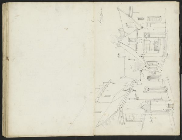
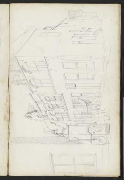
drawing, paper, ink, architecture
drawing
classical-realism
paper
ink
geometric
architecture
Dimensions: height 262 mm, width 188 mm
Copyright: Rijks Museum: Open Domain
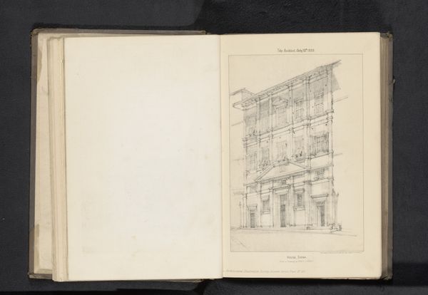
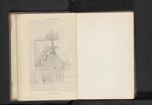
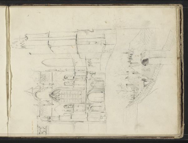
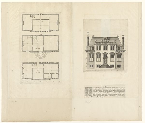
Curator: Let’s delve into this intriguing blueprint. It’s a reproduction of a design drawing for a castle, dating back to before 1889, attributed to Sprague & Co. We see meticulous ink work on paper. What springs to mind for you? Editor: My first thought is actually not about a castle but about potential—the bones of an idea. It reminds me of sketches in the margins of a poet's notebook, this delicate dance of lines sketching out not just structure, but possibility. There is this amazing feeling of an almost quiet, but palpable hum in it. Curator: Precisely. The drawing employs a classical-realist style, embedding it in a tradition of architectural representation heavily influenced by the elite tastes of the 19th century, and yet, you see, this method excludes any sense of labour involved in its design and potential construction, and by default normalizes its context as that of privilege and status. Editor: Oh absolutely. I can see how that stark presentation does disconnect the drawing from its lived realities. I almost feel like I want to grab my paint brushes to start adding figures and human dramas. Perhaps, if this design did get built, what the quotidian textures might have been, the sound of feet echoing in the corridors, the hushed tones of secret assignations. Curator: Such readings provide critical counternarratives. We could explore how architectural designs like this reflect not just aesthetic preferences but the hierarchical social order of the time, the stark geometry really enforcing a form of order, a type of…visual governance of social standing. Editor: Hmmm. It is so fascinating how art is never just what you see at face value. Now, with the stark structural form pointed out to me, I'm reminded a bit of visiting grand estates. You can feel grandeur, but there can also be this kind of, say, uncomfortable presence hanging in the very air of the room. Curator: Agreed. And it's in analyzing that "uncomfortable presence"—recognizing its historical roots in class disparity and exclusionary practices—that we, as audiences, engage with the broader legacy of power inscribed in this otherwise beautiful drawing. Editor: Thank you. Looking at it now with that layer peeled back. I’m sensing I should really rethink about whose story such art is reflecting, who had a place at the architect’s table and who got left outside the frame? Curator: Well, I’m delighted our exchange allowed for the artwork to become less about aesthetic appreciation, but rather how we may actively recognize and then reconcile history’s various uneven impacts and legacies through visual mediums. Editor: Yeah! Now my imagination’s on fire again! A different sort of fire now, one to melt the past! Thank you!
Comments
No comments
Be the first to comment and join the conversation on the ultimate creative platform.
More like this