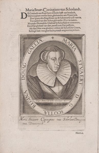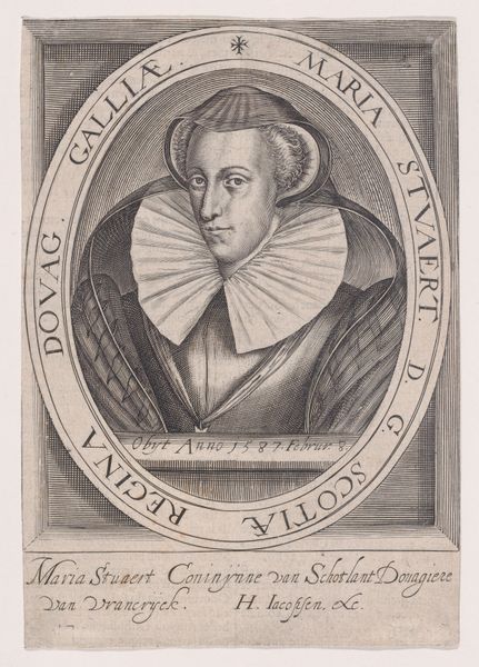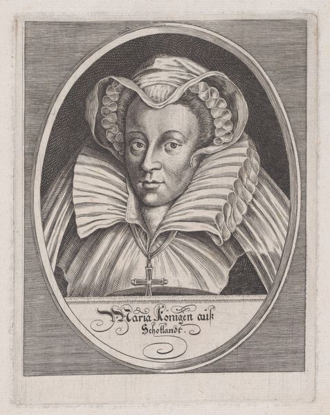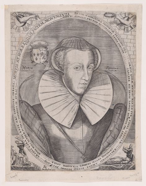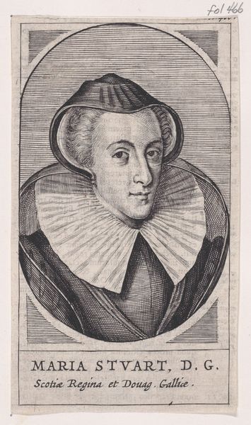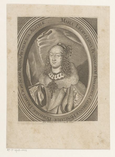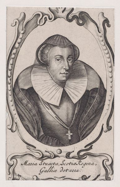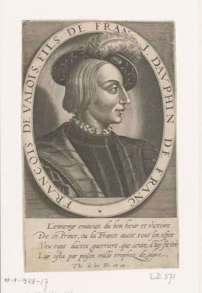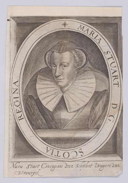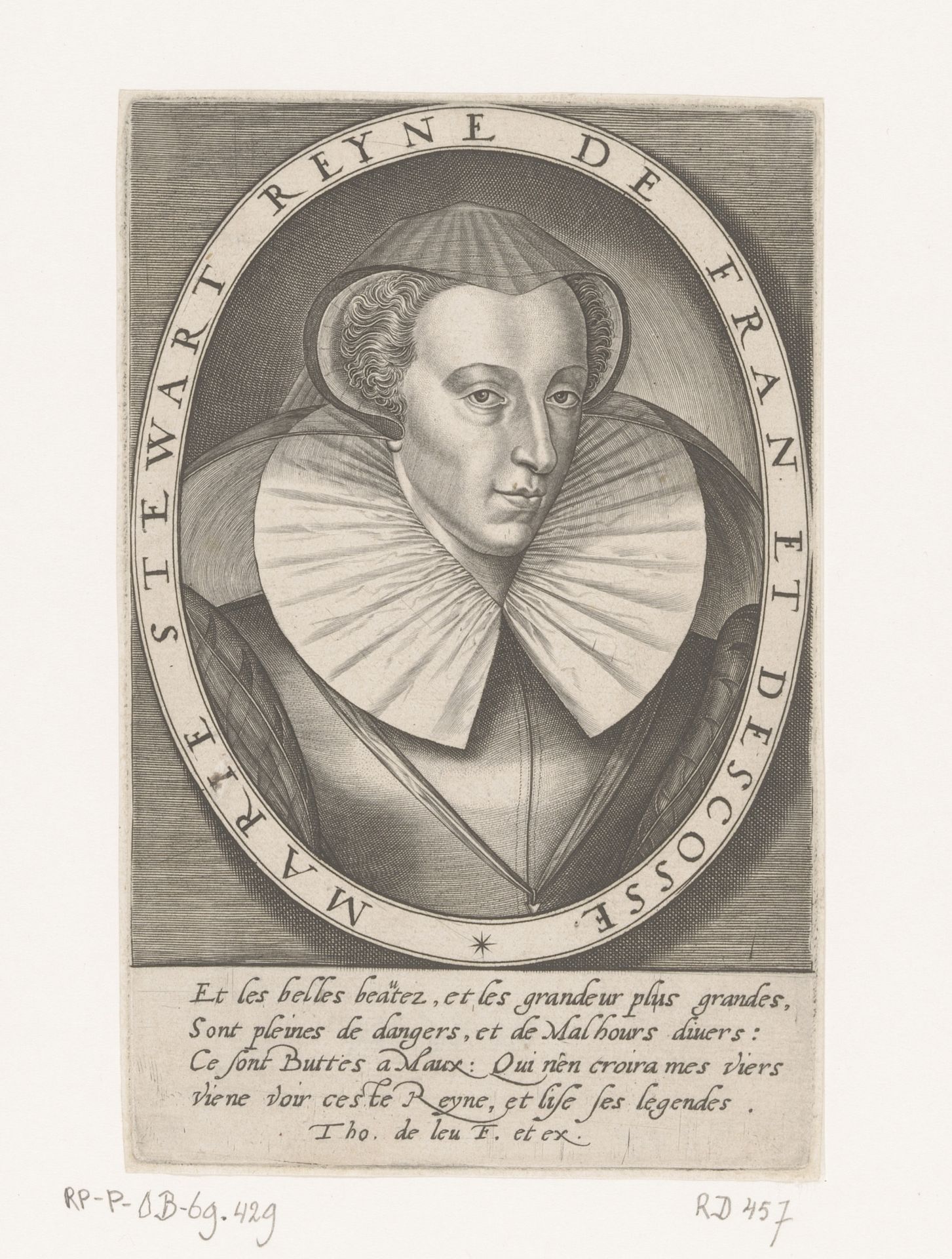
1576 - 1614
Portret van Maria I Stuart, koningin van Schotland
Listen to curator's interpretation
Curatorial notes
Editor: This is a portrait of Mary, Queen of Scots, made between 1576 and 1614 by Thomas de Leu, an engraving. The oval composition and stark contrast draw me in, but the detail in her ruff is just stunning. How do you interpret this work from a formalist perspective? Curator: Well, if we consider it purely from the vantage of form, we notice the careful interplay between the circular frame and the figure within. Observe how the artist utilizes line – both to delineate the form of Mary and to create tonal variation, offering very specific visual information. Notice the strategic use of hatching, particularly in creating volume in the face. How does this limited contrast and shading inform your understanding? Editor: I see it gives the piece a flattened quality, but I'm impressed by the sheer volume implied in the ruff using such fine lines! Are those textual elements incorporated for more than decorative effect? Curator: Precisely. In terms of purely formal qualities, the text functions as a shape and texture in contrast with the image of the sitter, yes. Note its linear, compact placement and framing effect when visually assessing the entire composition. Ask yourself how the contrast might function to establish visual unity within the pictorial frame. Editor: I hadn’t thought about it that way. Looking at the interplay of line and shape really spotlights the engraving technique. It is amazing all of that detail comes from the hatching alone! Curator: Indeed! Understanding the formal elements gives insight into both the artistic skill and visual intent. The arrangement of shapes and tones yields a balanced yet dynamic composition. What an informative session, wouldn't you agree?