Copyright: Ian Davenport,Fair Use
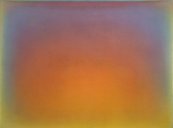
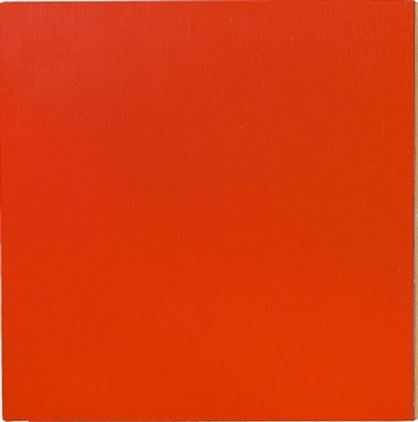
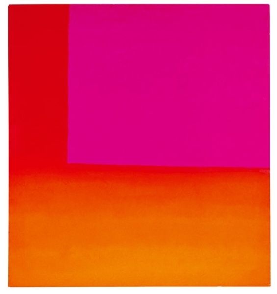
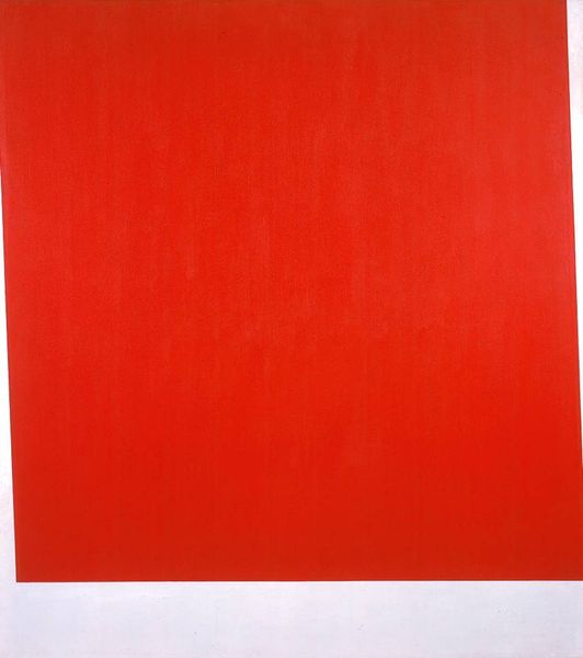
Editor: So here we have Ian Davenport's "Poured Painting: Orange, Red, Orange" from 1996, rendered in acrylic. It's, well, overwhelmingly orange! A big block of color, with what seems to be a very faint tonal gradient. It gives me a strange sense of imposing presence, like a Rothko, but flatter. What do you see in this piece? Curator: Immediately, I'm struck by the historical dialogue Davenport is entering into. Color Field painting was so much about removing the artist's hand, aiming for pure, unmediated color experience. How does a piece like this, made in the mid-90s, speak to that legacy? Is it a re-evaluation, perhaps, or a commentary? Editor: So you're saying this piece is not just about the color itself, but how the presentation challenges historical ideas of pure color and artist involvement? Curator: Precisely! The title suggests process, but the final product is this flat surface. It evokes the history of its making while concealing how the thing was put together. Think about the cultural landscape of the '90s. What does such blatant appropriation of Color Field mean when approached at the end of the 20th Century, or the beginning of the 21st century for that matter? What’s being critiqued, what's being celebrated? The piece itself has a history as well as is referencing a certain kind of history and that I find really compelling. Editor: I see! I hadn't thought about it that way. Looking closer, it's less about the surface color and more about its context in art history. That makes me rethink the flatness too – maybe it is inviting us to contemplate about Color Field through this one very specific geometric, orange moment. Curator: Indeed. And that orange... a very specific orange. Not subtle, is it? I wonder what that speaks to… Perhaps we’ll need another visit! Editor: Yes, I think I need to ponder more over all of this now.
Comments
No comments
Be the first to comment and join the conversation on the ultimate creative platform.