drawing, print, etching, glass, ink
#
portrait
#
drawing
#
baroque
#
dutch-golden-age
# print
#
etching
#
charcoal drawing
#
glass
#
portrait reference
#
ink
#
pencil drawing
#
genre-painting
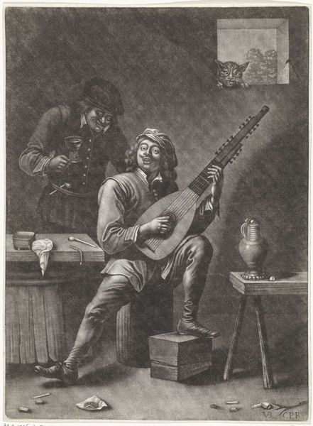
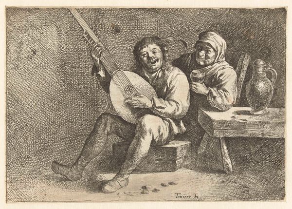
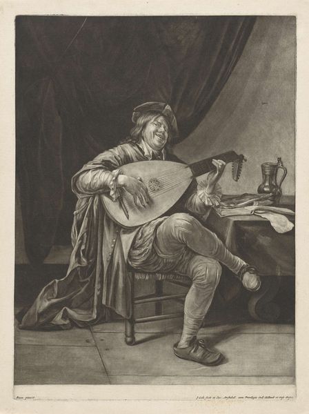
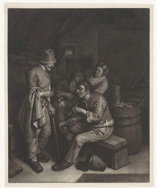
Dimensions: height 270 mm, width 206 mm
Copyright: Rijks Museum: Open Domain
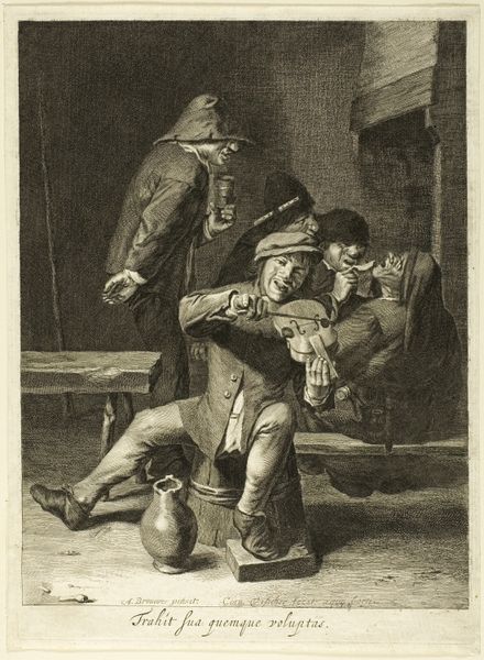
Editor: Here we have "Luitspeler en een staande man," or "Lute Player and a Standing Man," by Wallerant Vaillant, dating from around 1658 to 1677. It's currently held at the Rijksmuseum, and it appears to be an etching. I’m struck by the use of light and shadow to create such depth. What do you see in this piece, particularly from a formal perspective? Curator: Indeed, the dramatic interplay of light and shadow is compelling. Observe how Vaillant orchestrates tonal variations through meticulous cross-hatching and stippling. The figure of the lute player, bathed in a soft glow, becomes the focal point, his illuminated face contrasting starkly with the somber background. How do you perceive the composition? Editor: I see the lute player is front and center, but the other figure is leaning into the frame with a very active gesture. Is that a compositional choice to unbalance it? Curator: Precisely! The spatial tension created by the juxtaposition of the two figures invites deeper contemplation. Note the asymmetrical placement of the standing man and how he interjects from the margin and interrupts the focal clarity and visual hierarchy in place. What semiotic codes do you detect in this positioning, and how do they speak to the intended meaning of the work? Editor: The asymmetry is jarring. Perhaps the standing man represents interruption or discord? His blurred form clashes with the clear details of the lute player, especially in their facial expressions. Curator: An astute observation! Consider also the textural variations achieved through the etching technique—the smoothness of the lute versus the coarse texture of the clothing. Vaillant masterfully manipulates these elements to create visual interest and guide the viewer's eye. Notice, the overall image tone is very muted and it doesn't invite immediate appreciation. I was originally drawn to the detail and clarity in the men's faces. Editor: This formal breakdown really helps me see the layers of artistic intent that I initially missed. I am always tempted to see art as historical or biographical, but breaking it down with the attention on material and construction reveals different meaning. Thanks for sharing your view on it.
Comments
No comments
Be the first to comment and join the conversation on the ultimate creative platform.
More like this