screenprint, print, poster
#
stencil art
#
printed
#
screenprint
#
poster art
# print
#
op art
#
digital print
#
pop-art
#
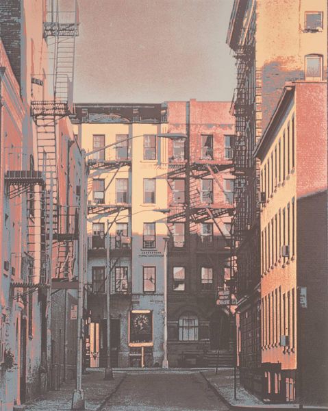
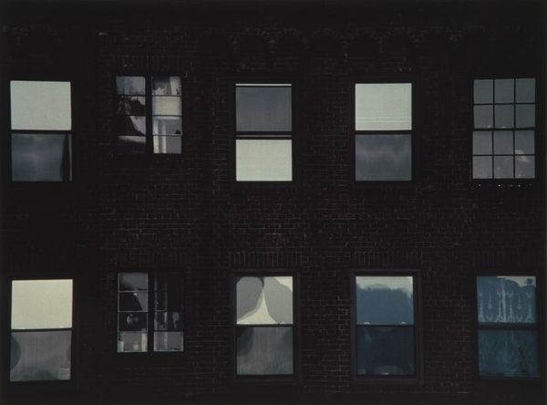
cityscape
#
poster
Dimensions: sheet: 53.34 x 53.34 cm (21 x 21 in.)
Copyright: National Gallery of Art: CC0 1.0
Curator: Right, so, feast your eyes on Andy Warhol’s print from 1968, titled "Flash—November 22, 1963." He made it using screenprinting, you know, that really iconic Pop Art technique. Editor: Immediately, that singular shade of lilac grabs you. It's both calming and unsettling against the grainy, almost newsprint quality. Feels distant, even faded—like a half-remembered dream. Curator: That tension is Warhol all over! He took images and moments – some deeply tragic – and reproduced them with mechanical detachment. The arrow, oversized and looming, sort of dominates everything. It’s all part of the *Flash* portfolio; he was playing on the idea of a collective trauma, broadcast through the media. Editor: That arrow's interesting to me, because of what it suggests about direction and viewership. Considering the title, it points less to progress, and more toward that architectural space: brick, stone, whatever. What were the means by which we were shown—given—access to information on JFK's assassination? What were the social consequences of those visual systems, and who benefited? Curator: Absolutely! And beyond just news coverage, it highlights how quickly this collective image becomes part of popular culture, repackaged for consumption. Think about it: the grainy texture mimics television screens of the era—low res, a constant broadcast of anxiety. He really nails the moment. Editor: It feels incredibly conscious of its production too. Pop art can flatten experience to be more readily exchanged; look, here's crisis repackaged and delivered directly to you as a domestic print. The commodification of, in this case, very specifically trauma itself—fascinating, and kind of brutal. Curator: Brutal, yes! Yet also… a way to make sense of the unfathomable. Maybe Warhol’s detached approach offers us a weird sort of protection. Like, look, we can engage with this...at a remove. What was important was his rendering of that, our understanding and processing it. Editor: Perhaps detachment, ironically, facilitates exchange. Assembled as it is of architectural details and basic semiotics, its mode of address mirrors its subject matter. I can definitely appreciate how he’s making us reconsider media consumption with such deliberate material choices. Curator: And really feel it, in your gut! Like an old photo you find in a dusty box, its immediate but strangely surreal presence evokes such specific memory. It feels relevant. Editor: Right—like that image, mass-produced and delivered across various materials. We get to contemplate the material reality, and impact, of it all.
Comments
No comments
Be the first to comment and join the conversation on the ultimate creative platform.
More like this