About this artwork
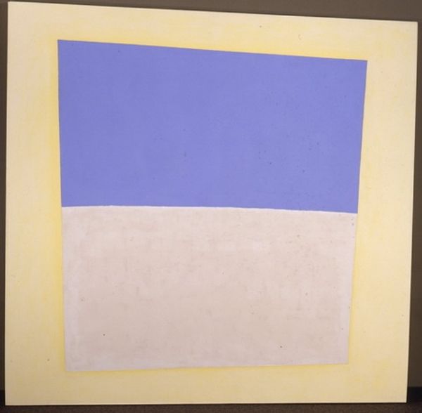
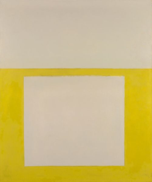
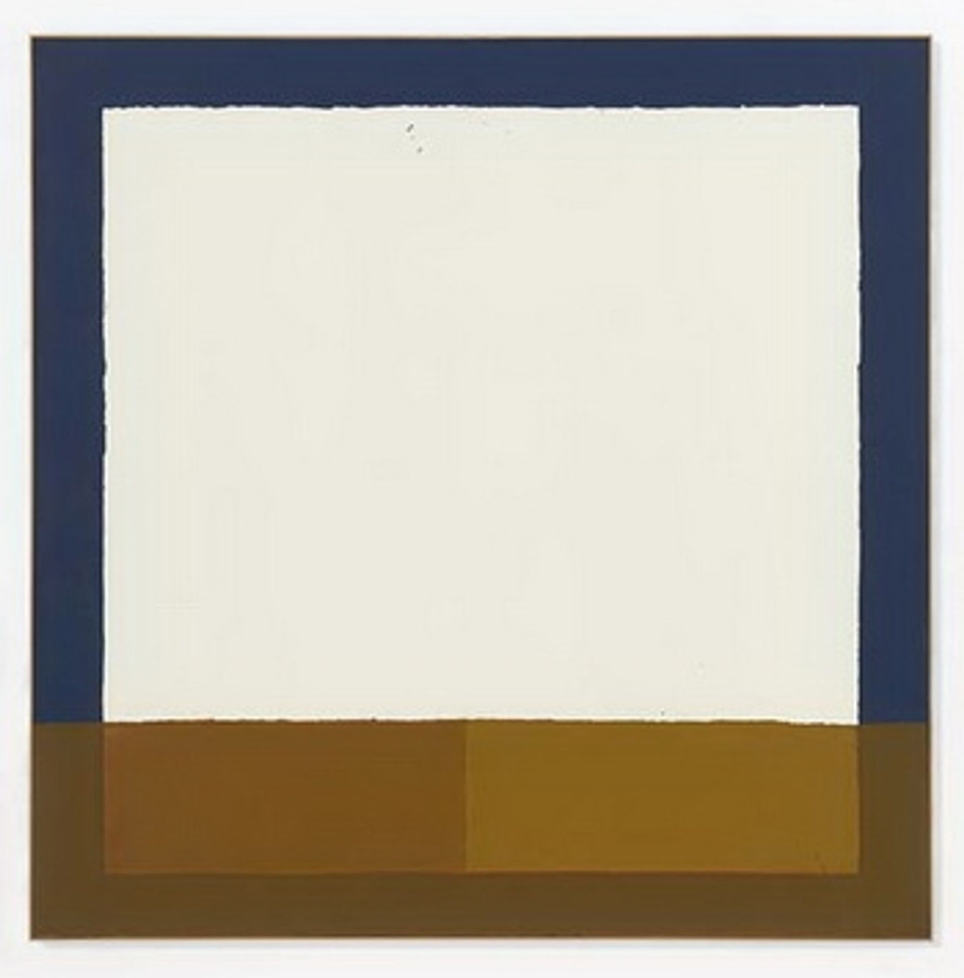
James Bishop made *Other Colors* with paint, probably sometime in the late twentieth century. At first glance, it seems simple, a white rectangle framed by bands of blue and brown, but it's also really complex, you know? Look closely, and you'll notice the paint isn't perfectly smooth. The texture is soft, and the blue isn’t a flat plane, it's got tiny imperfections, little brushstrokes that catch the light and give it a pulse. Then there’s that off-white rectangle in the middle, slightly creamy, like a quiet breath. That color feels very considered. I'm reminded of Agnes Martin’s quiet, minimalist paintings, but there’s also something very individual about Bishop’s color choices and the way he applies the paint. It's like he's inviting us to slow down and really look, to notice the subtle beauty in the everyday. It’s a painting that doesn’t shout, but whispers.
Artwork details
- Copyright
- James Bishop,Fair Use
Tags
Comments
Share your thoughts
About this artwork
James Bishop made *Other Colors* with paint, probably sometime in the late twentieth century. At first glance, it seems simple, a white rectangle framed by bands of blue and brown, but it's also really complex, you know? Look closely, and you'll notice the paint isn't perfectly smooth. The texture is soft, and the blue isn’t a flat plane, it's got tiny imperfections, little brushstrokes that catch the light and give it a pulse. Then there’s that off-white rectangle in the middle, slightly creamy, like a quiet breath. That color feels very considered. I'm reminded of Agnes Martin’s quiet, minimalist paintings, but there’s also something very individual about Bishop’s color choices and the way he applies the paint. It's like he's inviting us to slow down and really look, to notice the subtle beauty in the everyday. It’s a painting that doesn’t shout, but whispers.
Comments
Share your thoughts