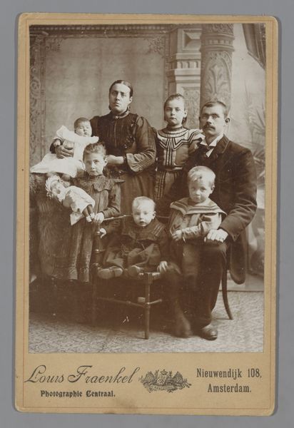
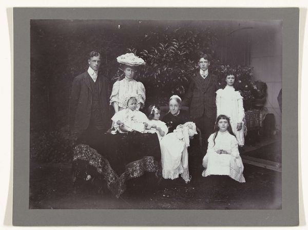
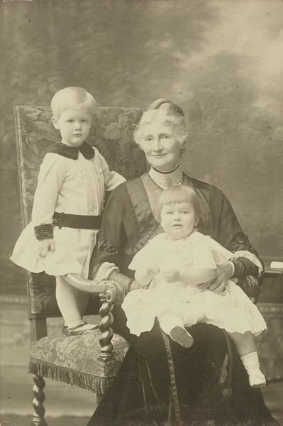
Portret van de vijf kinderen van de fotograaf (Sacha, Renée, Dorothée, Thelma, en Irène) met een nanny Possibly 1910 - 1916
0:00
0:00
henrypauwvanwieldrecht
Rijksmuseum
photography, gelatin-silver-print
#
portrait
#
dutch-golden-age
#
archive photography
#
photography
#
historical photography
#
gelatin-silver-print
Dimensions: height 125 mm, width 173 mm, height 143 mm, width 194 mm
Copyright: Rijks Museum: Open Domain
Editor: Here we have a gelatin-silver print from possibly 1910 to 1916 by Henry Pauw van Wieldrecht, entitled "Portret van de vijf kinderen van de fotograaf... met een nanny". I'm immediately struck by the formal arrangement, it's almost like a stage play, everyone positioned carefully for the camera. What stands out to you? Curator: The photograph is structured by a distinct hierarchy. Consider the tonal values: The composition adheres to a pyramidal structure, firmly anchored by the dark mass of the nanny's dress. Notice how that creates visual stability and frames the central figures, drawing the eye directly to the children's faces. What do you make of that stark contrast between dark fabric and pale skin? Editor: It feels deliberate. The white clothing of the infant and the lighter faces definitely pop against the darker clothing of the older kids and nanny. Curator: Precisely. Van Wieldrecht employs chiaroscuro – a balance between light and shadow. The strategic use of light sculpts their features and the details on the lace, almost emphasizing their innocence and delicacy. But, equally important is how their faces are all directed out towards us – notice the diagonal arrangement? How does it disrupt that symmetry? Editor: I see what you mean. Instead of everyone aligned perfectly, their gazes and subtle variations in their posture introduce a dynamic element, breaking the severity of the composition. It also suggests perhaps they don't necessarily want to be posing so formally. Curator: An interesting observation, and one worth considering! The materiality, as a gelatin silver print, allows for this exquisite control of tonal gradations. It permits capturing those ephemeral details which might otherwise go unnoticed. Editor: That’s fascinating. So much thought went into what appears at first glance as just a straightforward family portrait. Thanks for illuminating the art of seeing. Curator: Indeed. Form and structure reveal so much.
Comments
No comments
Be the first to comment and join the conversation on the ultimate creative platform.
More like this