drawing, paper, pen
#
script typeface
#
drawing
#
script typography
#
hand-lettering
#
hand drawn type
#
feminine typography
#
hand lettering
#
paper
#
hand-drawn typeface
#
modern calligraphy
#
thick font
#
pen
#
handwritten font
Copyright: Rijks Museum: Open Domain
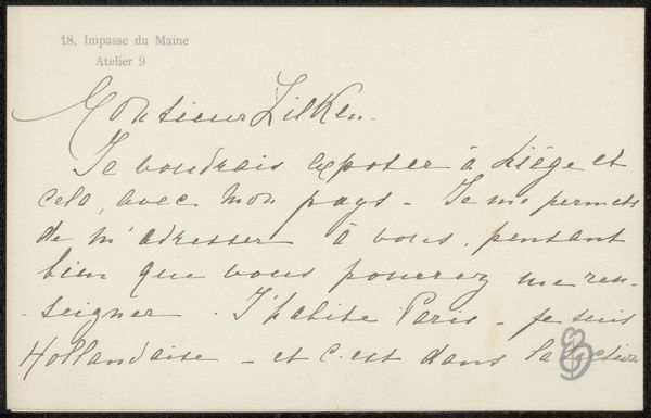
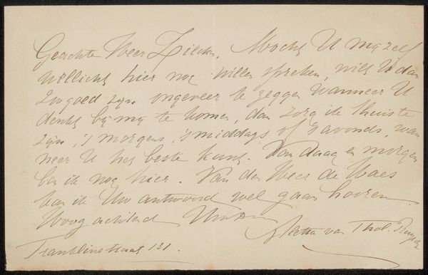
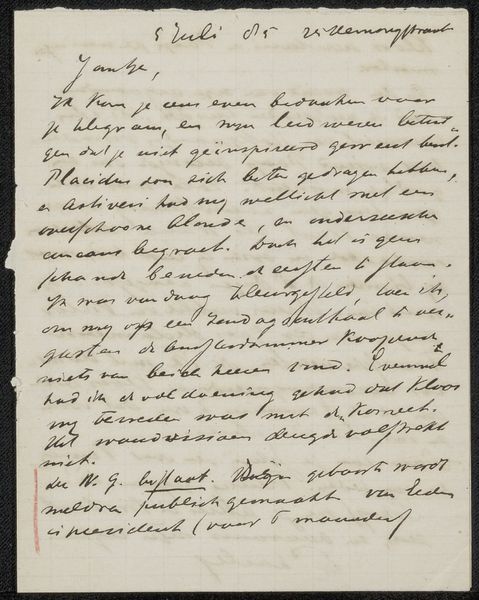
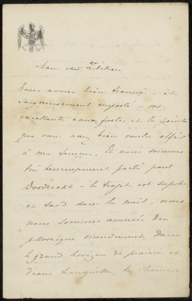
Curator: Isn’t it intriguing? This is a letter, entitled "Brief aan Philip Zilcken," penned likely between 1900 and 1905 by Edmond Picard. It's currently housed at the Rijksmuseum. Editor: It feels intensely personal, doesn't it? Almost voyeuristic to be peering at someone’s correspondence, the graceful slope of the handwriting seems laden with unspoken emotion. There is a melancholic atmosphere; I wonder why the recipient’s silence has provoked this letter? Curator: The language used offers an entry point; Picard writes about his “quiéte” – worry – about paintings sent to a Monsieur Boulanger, enquiring as to their fate and return. It’s done with elegance. Editor: I'm struck by the subtle power dynamics. Picard, the sender, obviously felt disrespected enough by the lack of reply to pen this note, and risk further antagonising the recipient. He couches his request in polite language and well-wishing, yet his anxiety seeps through. Curator: Exactly. And the fact it is written in French during this period speaks volumes about Picard's background as a lawyer and writer. He belonged to a highly educated class, in contact with wider cultural landscapes across Europe. The formal script hints at this established and bourgeois status, it makes you question how common the access to formal letter-writing like this might have been. Editor: Absolutely, the very act of writing such a letter could indicate a position of social privilege. This type of literacy granted power. In that context, the handwritten script becomes a conscious choice, a demonstration of refinement, and a rebuke aimed towards the recipient for not responding. Curator: Do you notice, too, the way that even within the neatness there’s an inconsistency to it? Some letters are formed so elegantly, and then there is a flourish elsewhere, it humanises what could appear clinical. Editor: The choice to employ cursive handwriting acts as a kind of visual code. The almost calligraphy like use hints towards cultural capital, as a practice linked to female accomplishment, with associations of upper class socialisation. Considering Picard's standing in the artistic world, was it intended to undermine Zilcken, making a dig about artistry itself? Curator: It truly allows a look behind the surface doesn't it? There is always much more here than immediately apparent in handwriting such as this. It is almost more interesting to have this fragment, as opposed to a very deliberate finished piece, isn't it? Editor: Absolutely. It offers an opening to consider the intricate relationships underpinning the art world at the time and the wider networks that the letter attempts to engage and solidify, making us pause and contemplate all that went unsaid between the lines.
Comments
No comments
Be the first to comment and join the conversation on the ultimate creative platform.
More like this