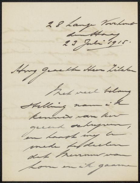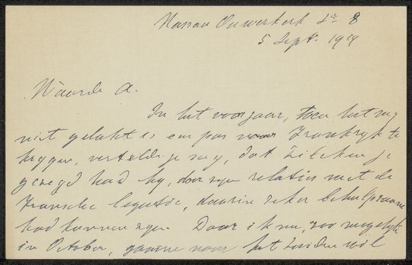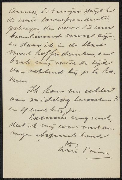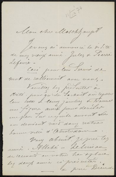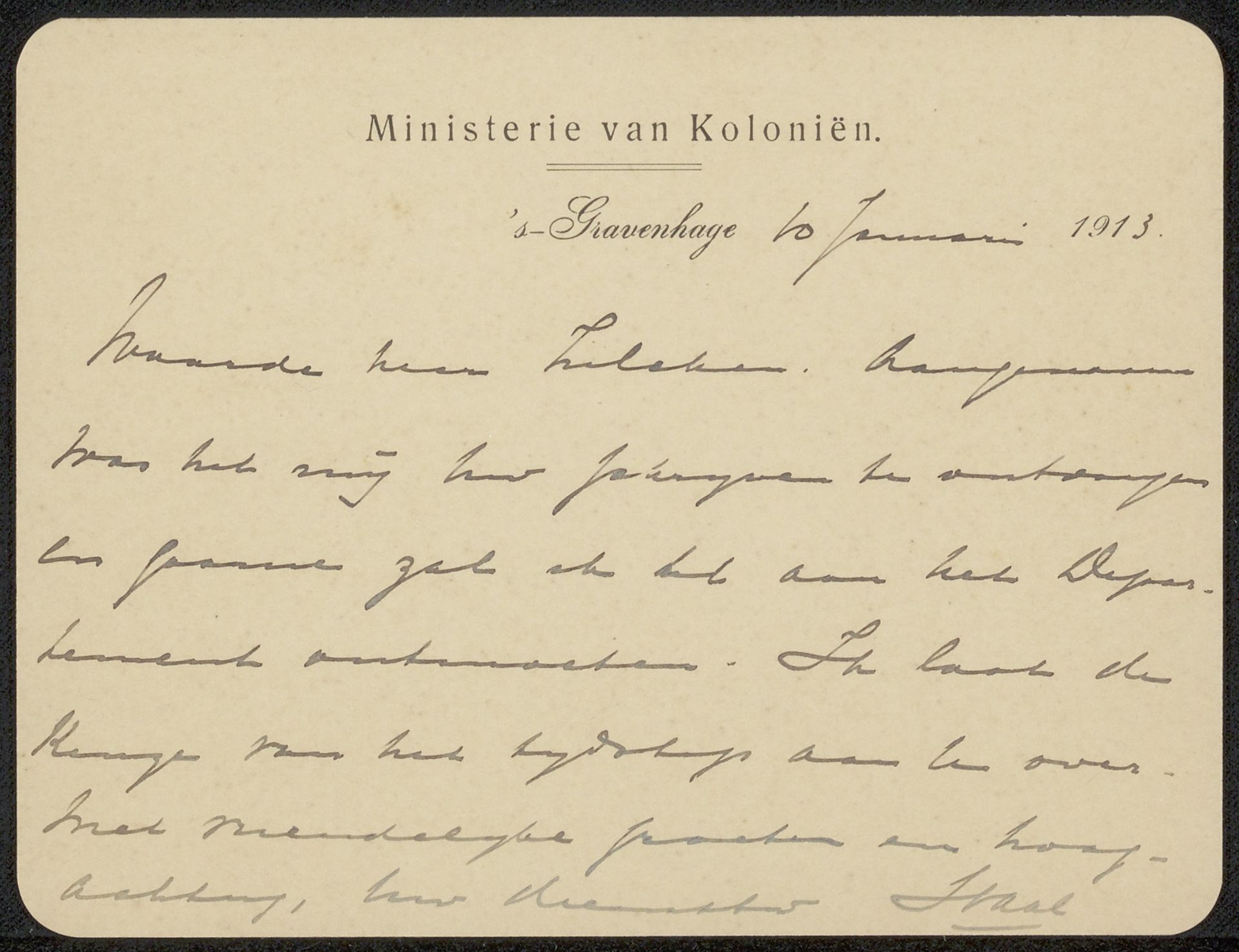
Possibly 1913
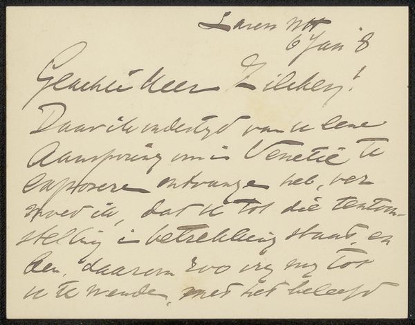
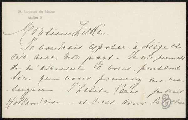
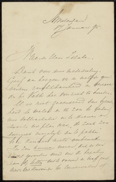
Brief aan Philip Zilcken
Listen to curator's interpretation
Curatorial notes
Curator: I'm struck by the immediacy of "Brief aan Philip Zilcken," thought to be from 1913, created with a mixed media of ink, graphite, and pen on paper. It's a peek into correspondence, seemingly from the Ministerie van Koloniën, or Ministry of Colonies. Editor: My first thought? It’s intimate, almost ghostly. That handwriting, faded yet insistent, really draws you in, as if the very page is whispering secrets. Curator: Yes, the handwriting itself is quite telling, functioning almost like an emblem of its era. Handwriting, especially script typography and hand-drawn typefaces, often carry an incredible cultural and social weight. Editor: Absolutely. It evokes a time of quill pens, wax seals... a slower pace, right? The age of the paper itself—that warm, yellowed tone—adds so much texture, making it more than just a message. It feels almost like a relic. Curator: In this context, knowing it comes from the Ministry of Colonies—the administration for colonial governance—amplifies its historical significance. Consider the symbolic importance attached to formal written communication in power dynamics and bureaucratic control during this era. It's far removed from a quick email. Editor: Definitely layers to unpack there. It also gives a glimpse into a private relationship, despite coming from officialdom. "Waarde heer Zilcken," which begins the note, implies a certain intimacy, and it hints to more than what is visible, sparking a desire to know more, don't you think? Curator: Indeed, what was deemed necessary to capture by hand and ink holds unique emotional weight. Its preservation reveals the document's intended legacy as an authoritative testament, worthy of permanent preservation. The selection of graphite and pen and the medium of paper shows intention of holding authority over future generations. Editor: I love that contrast, really. It reminds me of old family letters tucked away in attics. This piece bridges officialdom with private affairs. It makes me wonder, what were the policies this letter facilitated, and what lasting human impact followed because of it? Curator: An important inquiry, considering that the visual texture combines administrative purpose with private reflection, perhaps showing the blurred boundaries between professional and personal influence during the time. Editor: Yes, its more than just a pretty page, there’s complex emotions in play. Thanks for digging into the deeper meanings, as always! Curator: The intersection of history and intimacy is a compelling meeting point.