painting, watercolor
#
portrait
#
painting
#
watercolor
#
historical fashion
#
coloured pencil
#
watercolour illustration
#
genre-painting
#
modernism
Copyright: Public Domain: Artvee
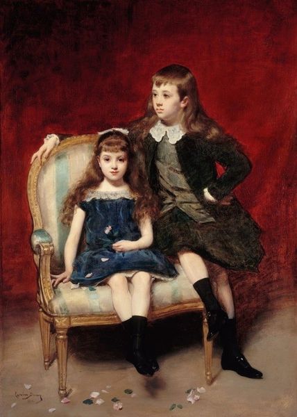
Jessie Willcox Smith made this illustration for Good Housekeeping, and you can see that Smith is doing something very gentle here. It’s not too saccharine, not too sweet, because she's really paying attention to the colour relationships and to the subtle tonality. The colour palette is very limited, the background is a kind of cream, with small, dry brushstrokes. Look at the way the red in the older child’s dress seems to float against the black of the jacket and the dark zigs at the hem. They're really making the red pop. She’s using a kind of slightly transparent colour there, and if you look closely, you can see the texture of the paper underneath, so it feels light and airy. If you're familiar with the work of someone like Alice Neel, another artist interested in children and portraiture, Smith has a similarly idiosyncratic approach to figuration, but is really coming from a more traditional illustration background. This is a piece that knows what it's doing.
Comments
No comments
Be the first to comment and join the conversation on the ultimate creative platform.
More like this