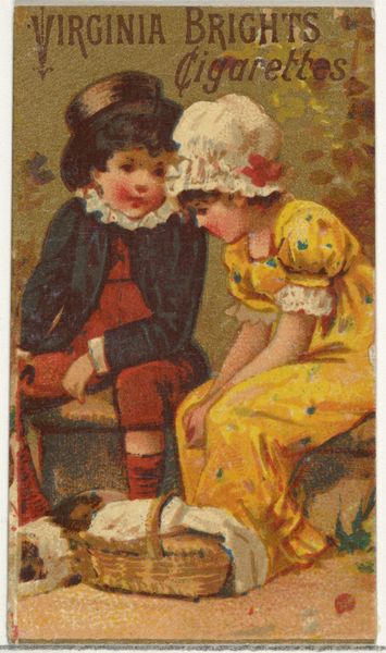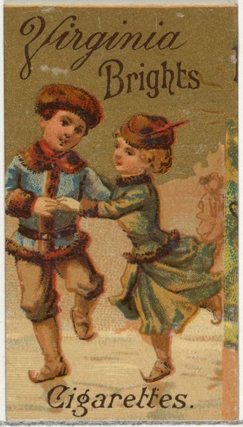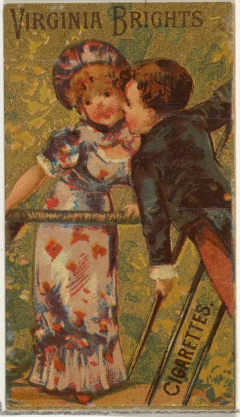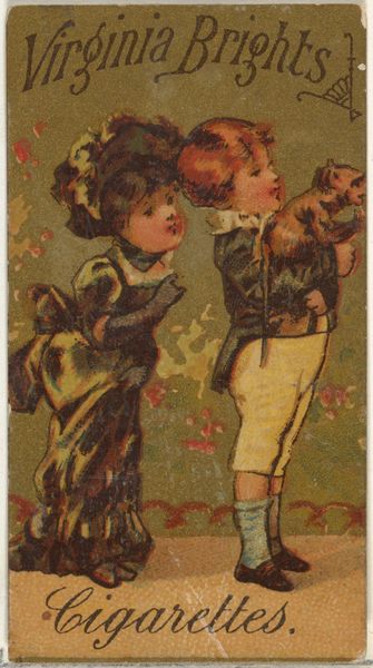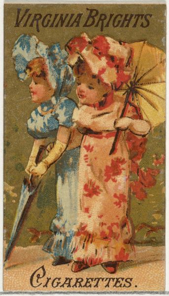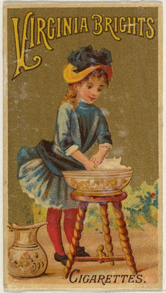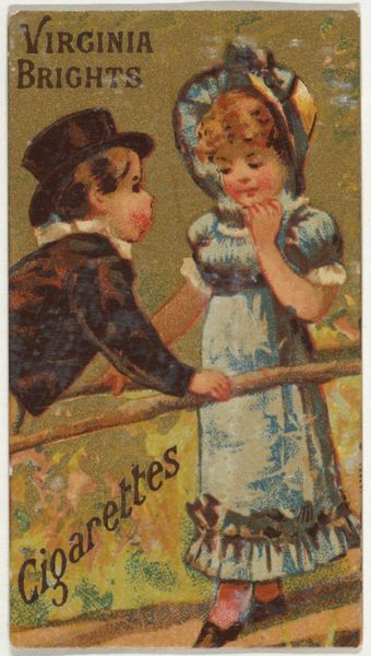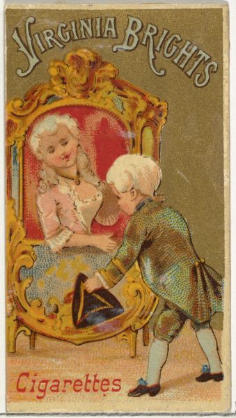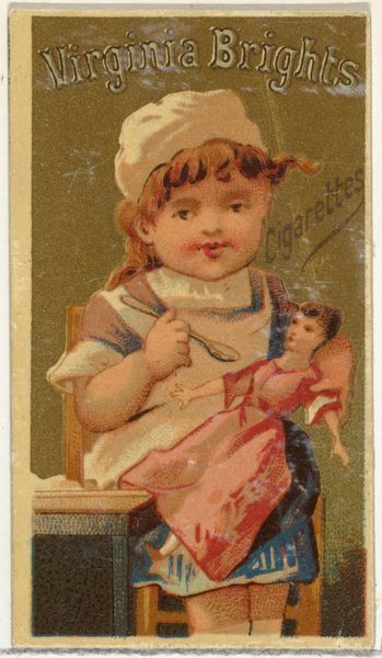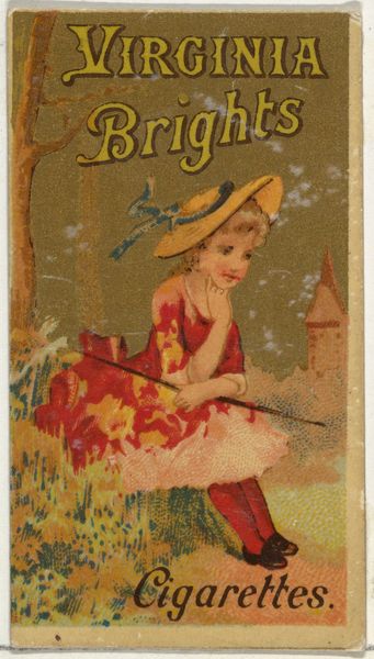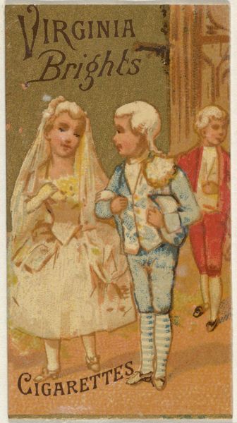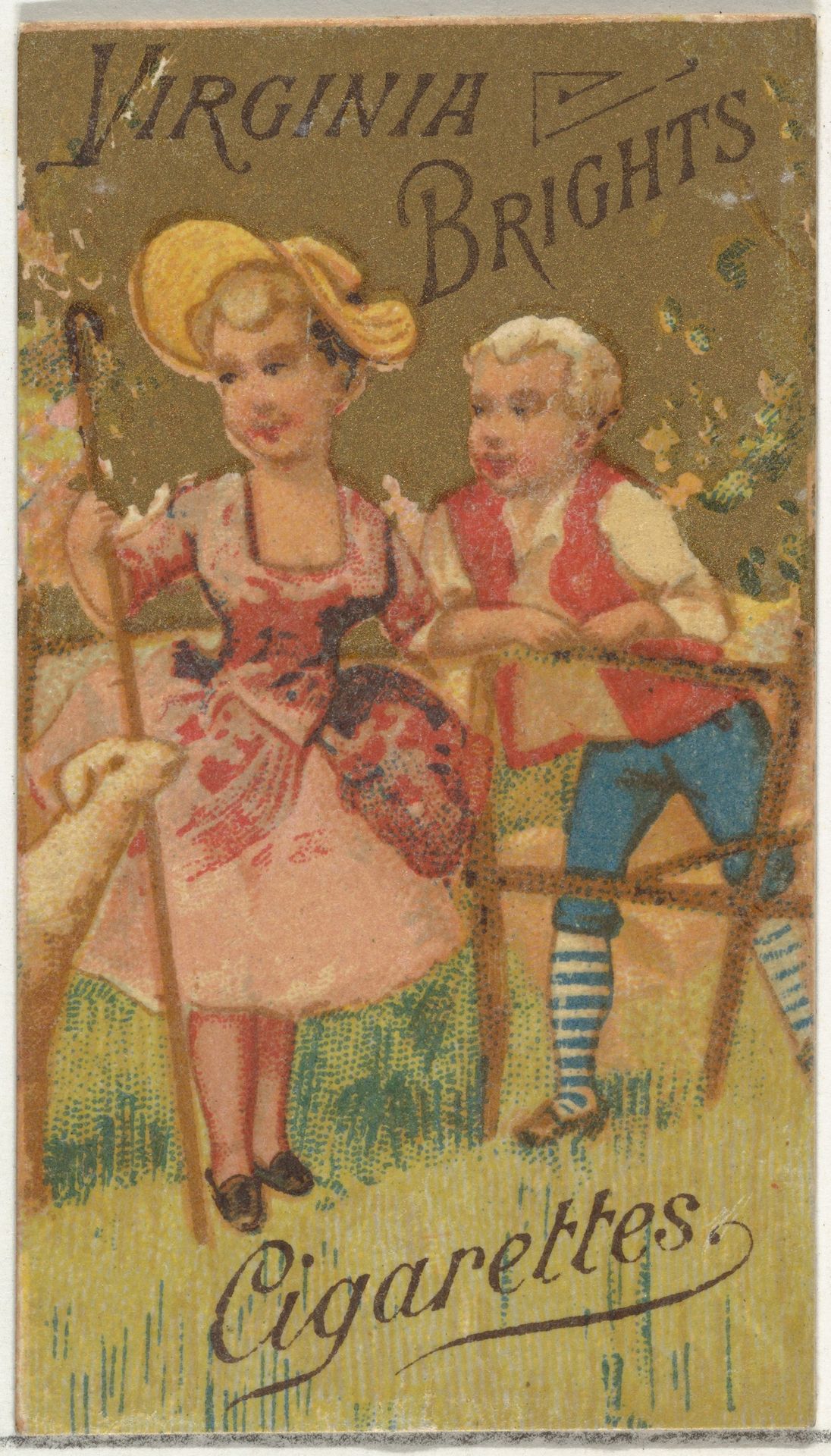
1886
From the Girls and Children series (N64) promoting Virginia Brights Cigarettes for Allen & Ginter brand tobacco products
Listen to curator's interpretation
Curatorial notes
Curator: This diminutive colored-pencil drawing from 1886 is actually a promotional print produced by Allen & Ginter for their Virginia Brights Cigarettes. Part of their "Girls and Children" series, it currently resides in the Metropolitan Museum of Art. What’s your first take? Editor: It's unsettlingly idyllic. The forced cuteness of the children and those overly bright pastel colors... there’s a strange artificiality at play that creates unease. Curator: Consider the social context. These cards, inserted into cigarette packs, were essentially trading cards targeted at adult men. The imagery, often romanticized depictions of childhood innocence, served to normalize tobacco use and associate it with positive, even wholesome, values. Editor: I see your point, the commercial element immediately taints the supposed ‘innocence.’ But let’s not dismiss the formal aspects entirely. Note the careful symmetry in their placement, anchoring our eye. The limited color palette—pink, blue, beige—further intensifies the impression of unreality, but also evokes an emotional, soft dreaminess. The composition itself is a constructed fiction. Curator: Exactly! The fictional world Allen & Ginter created through these images shaped perceptions and desires. Think about it: the branding strategy leveraged potent visual messaging, helping normalize smoking and cultivating the company’s cultural impact, even shaping gender and class expectations. The cards portrayed an aspiration of purity and prosperity – sold alongside addiction. Editor: I can't shake the sense of dissonance the composition evokes. There is that roughness too. Look closely – the hatching lines create depth but they’re also crudely applied. This textural contradiction is jarring. Are we meant to focus on reality or escape it? Curator: The duality is deliberate. Allen & Ginter’s prints represent an early and effective attempt to create and circulate images aligned with a specific agenda. They provide insight into how powerful institutions historically promoted consumerism through manipulated nostalgia. Editor: In short, behind the "cuteness", lies a clever, ethically dubious strategy. Looking at this through our contemporary lenses, this card becomes an emblem of capitalist manipulation. Curator: Absolutely. This little print acts as a case study into how marketing images perpetuate and shape culture through mass consumption. Editor: A compelling reminder of how critical analysis can reveal disturbing depths within the seemingly saccharine.