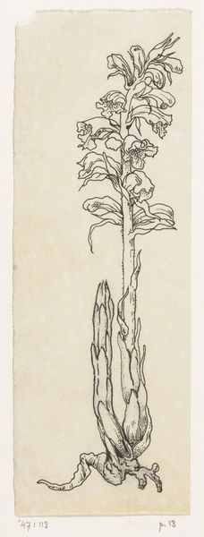
drawing, paper, ink
#
drawing
#
pen sketch
#
paper
#
ink
#
plant
#
line
#
realism
Dimensions: height 411 mm, width 245 mm
Copyright: Rijks Museum: Open Domain
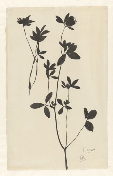
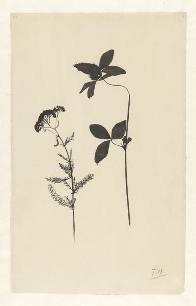
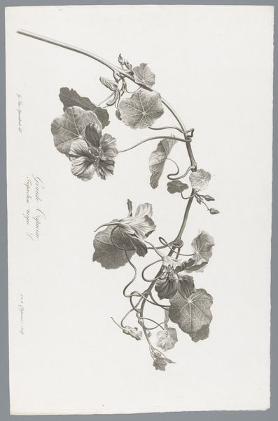
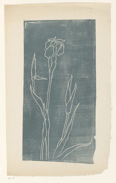
Editor: Here we have Theo Nieuwenhuis’s “Bloeiende plant, met de wortels,” a plant rendered in ink on paper, dating from somewhere between 1876 and 1951. I find the starkness of the plant against the plain background very striking. What aspects of its composition stand out to you? Curator: Indeed, the contrasting values certainly establish a visual hierarchy, immediately directing our focus to the botanical specimen. Note the artist's employment of line – how it varies in weight to define both the delicate roots and the more substantial foliage. Consider the tension created between the realism of the botanical study and the abstract quality of the silhouette against the bare ground of the paper. Editor: So the starkness isn't just about being simple, but also a deliberate choice about contrast and line? Is the interplay of those aspects a key part of its meaning? Curator: Precisely. Meaning emerges from the formal relationships established within the work. Ask yourself how the texture achieved through ink handling – the delicate stippling versus the bolder strokes – informs your understanding of the plant’s structure. Moreover, the negative space surrounding the plant is not merely emptiness; it activates the composition and highlights the form. Editor: That makes so much sense, it directs the eyes! And the negative space gives the plant a sense of lightness. Thank you. It is interesting how focusing on just the elements of art enhances the viewing experience. Curator: Indeed. This detailed visual analysis unveils the artist's intent and deepens our engagement with the artwork. The careful manipulation of formal elements constitutes the artwork's inherent message.
Comments
No comments
Be the first to comment and join the conversation on the ultimate creative platform.
More like this