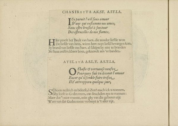
Kwatrijnen bij de voorstellingen van Amolosa C.S. en Deboreda V.D.V.A. 1640
0:00
0:00
crispijnvandeiipasse
Rijksmuseum
print, typography
#
dutch-golden-age
# print
#
typography
Dimensions: height 140 mm, width 190 mm
Copyright: Rijks Museum: Open Domain
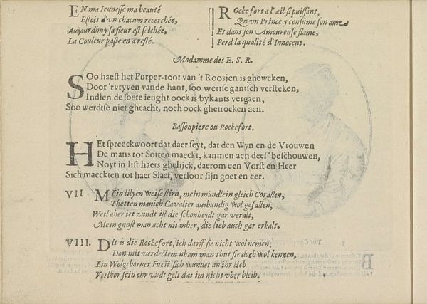
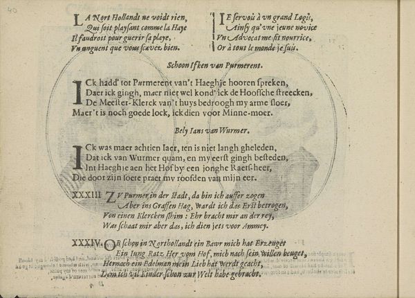
Editor: This is "Kwatrijnen bij de voorstellingen van Amolosa C.S. en Deboreda V.D.V.A.," a print from 1640 by Crispijn van de Passe II, currently housed at the Rijksmuseum. It’s…mostly typography, right? I'm drawn to the decorative initials. What catches your eye? Curator: The typography itself! Look closely; those initial letters, intertwined with floral designs, were meant to conjure associations with illuminated manuscripts, religious devotion, even aristocratic display. The act of reading becomes a symbolic performance. What deeper meanings can we draw from these women and the verses about them? Editor: Hmmm, the verses seem to praise Amolosa for her beauty and chastity, and Deboreda as a virtuous widow, a shepherdess devoted to God… were these real women, elevated to symbols of virtue? Curator: Precisely! This print functioned almost like a miniature monument. It's an act of immortalization through text and image. These women become cultural touchstones, reminding the viewer, particularly other women, about aspirational values. How do you feel their image is being manipulated? Editor: I suppose they're presented as these perfect ideals, which feels a bit…one-dimensional? Curator: It reflects a social need, doesn't it? The idealized representation of women ensured continuity of societal norms. Their stories become instructive narratives embedded into cultural memory. We understand this artistic object better through exploring social psychology. Editor: So, the print’s not just about these women, but about the values society wanted to promote? The image becomes secondary to the symbolic function? Curator: Indeed. By dissecting the image’s inherent symbolism, we understand cultural memory better, a memory sustained not just by text, but its mode of presentation. It reveals a narrative carefully constructed through specific artistic choices. Editor: I see, so even simple typography can be laden with symbolic meaning beyond its literal content! That’s a very helpful perspective.
Comments
No comments
Be the first to comment and join the conversation on the ultimate creative platform.
More like this