print, engraving
#
baroque
# print
#
landscape
#
figuration
#
engraving
Dimensions: 4 11/16 x 6 11/16 in. (11.91 x 16.99 cm) (image)6 1/8 x 7 7/8 in. (15.56 x 20 cm) (sheet)9 5/16 x 11 7/8 in. (23.65 x 30.16 cm) (mount)18 1/16 x 14 1/16 in. (45.88 x 35.72 cm) (mat)
Copyright: Public Domain
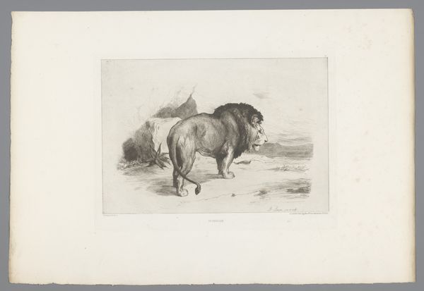
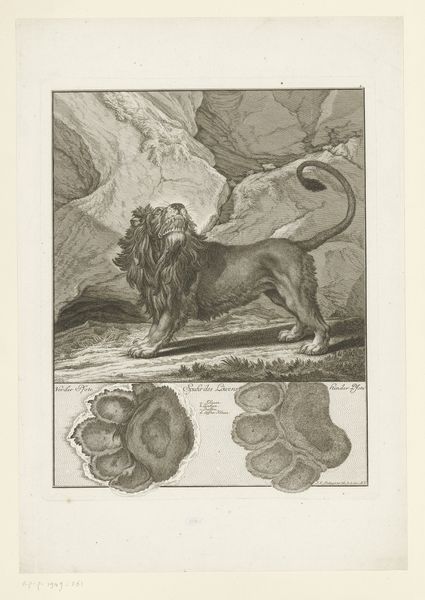
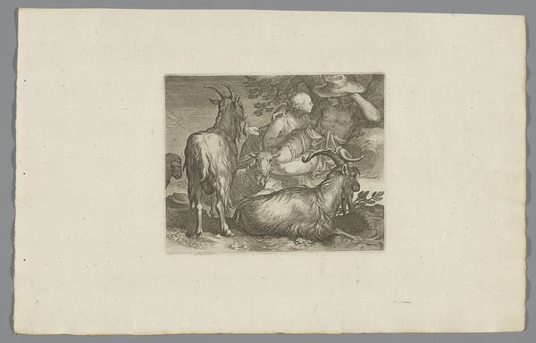
Editor: This is "Variæ Leonum Icones," an engraving by Abraham Blooteling from around the 17th century. I’m immediately struck by the stark contrast between the lion in the foreground, alert and almost menacing, and the one behind it, which is receding into the background. What visual strategies is the artist employing here to direct our focus? Curator: A crucial observation. The piece meticulously uses line weight and density to guide the viewer's eye. Notice how the foreground lion's mane is rendered with significantly denser, darker lines. This creates a focal point and imbues the creature with a sense of immediate presence, contrasting sharply with the other's subtle hatching. Editor: So, it’s all about directing our gaze through differences in texture and depth. But what about the composition? Curator: Precisely. The composition reinforces this hierarchy through spatial arrangement. The positioning of the figures – one nearly filling the frame, the other partially obscured – creates depth. Moreover, examine the formal qualities; consider the angularity of the rocks compared to the sinuous curves of the lions' bodies. Are these deliberate choices contributing to the overall reading of power and docility, or something else? Editor: That's interesting, I hadn't considered the angularity of the rocks as a direct contrast. I'm beginning to see how the whole thing builds towards emphasizing specific details to create its own internal system. Curator: Indeed. Consider further the engraver’s use of light and shadow, creating drama within a deliberately confined plane. And do the formal aspects, such as the use of diagonal lines that guide our eyes toward a spot to the upper left, evoke a sense of depth that goes against the actual depth present within the artwork? Editor: It's like the visual tension gives it so much depth despite it being printmaking, right? Okay, thank you. Curator: Exactly. Each line, each carefully placed mark, contributing to a carefully considered whole.
Comments
No comments
Be the first to comment and join the conversation on the ultimate creative platform.
More like this