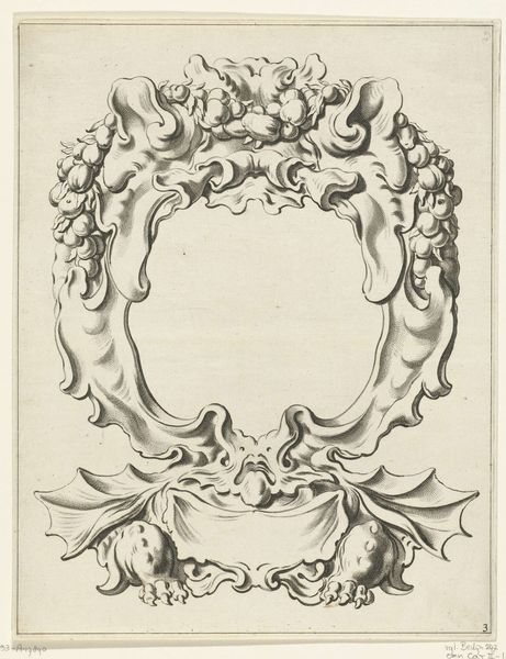
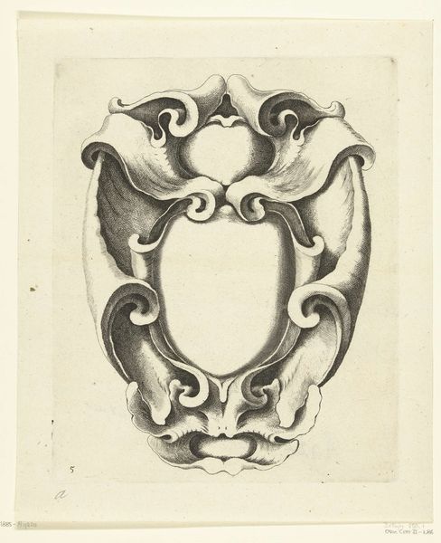
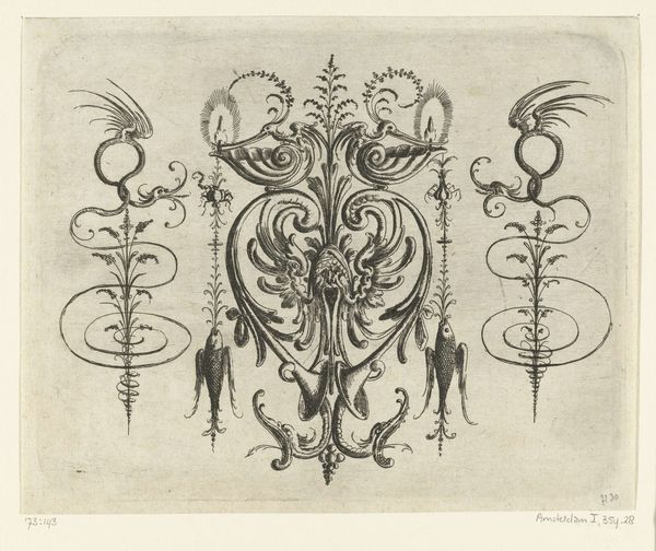
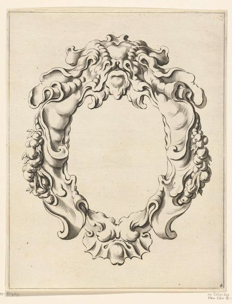
Cartouche met kwabornament bestaande uit twee compartimenten 1655
0:00
0:00
pieterhendrickszschut
Rijksmuseum
drawing, ink, engraving
#
drawing
#
baroque
#
pen drawing
#
pen sketch
#
old engraving style
#
ink
#
geometric
#
line
#
decorative-art
#
engraving
Dimensions: height 253 mm, width 197 mm
Copyright: Rijks Museum: Open Domain
Editor: Here we have "Cartouche met kwabornament bestaande uit twee compartimenten," a drawing from 1655 by Pieter Hendricksz. Schut, currently residing in the Rijksmuseum. It's so ornate! All these swirling lines and shapes… it's almost dizzying to look at. As a drawing, I'm interested in how such an elaborate object might have been practically used in the time. What role might something like this play in society? Curator: That’s a fantastic question. Cartouches like this, particularly during the Baroque period, weren't simply decorative doodles. They were deeply connected to power and visual communication. Think of them as elaborate picture frames. Editor: Like, for portraits? Curator: Potentially, yes. But also for coats of arms, or even inscriptions meant for public display. These weren't just about beauty; they were about broadcasting status and authority. They would be placed in public facing spaces to send a clear message. Do you notice anything about the specific shapes and forms used here? They aren't quite floral or animalistic in an obvious sense. Editor: Well, they seem almost…organic? Like strange, inflated seashells or something. Is that intentional? Curator: Precisely. The "kwabornament" style was quite popular then. Consider the political and economic climate in the Netherlands at that time: The Dutch Golden Age. Exploration, trade, a rising merchant class… This ornamental style, with its allusions to exotic, organic forms, reflects that expansionist mindset and the influx of new goods and ideas. How do you think these designs reflected Dutch identity at the time? Editor: So, these designs weren't just pretty; they were statements of cultural identity and aspirations. It makes me rethink how seemingly 'decorative' arts can actually be very powerful cultural objects. Curator: Exactly! It’s all about context. Editor: Thanks, it really puts this into perspective. I would've glossed over this if I didn't see the greater social history behind the pen strokes.
Comments
No comments
Be the first to comment and join the conversation on the ultimate creative platform.
More like this