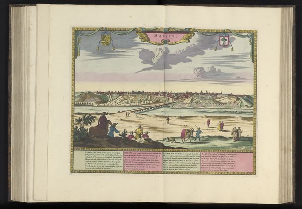
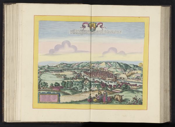
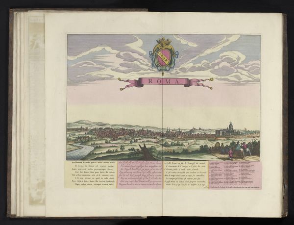
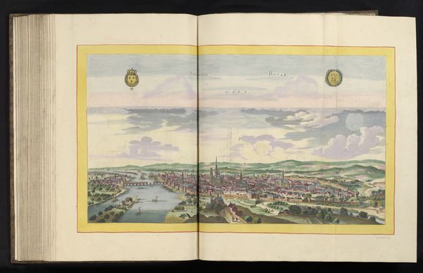
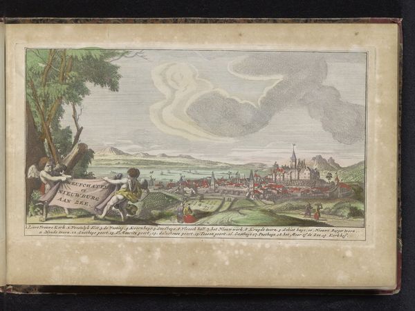
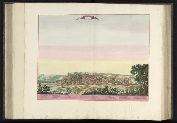
print, watercolor
#
baroque
# print
#
landscape
#
watercolor
#
coloured pencil
#
cityscape
#
genre-painting
Dimensions: height 154 mm, width 210 mm
Copyright: Rijks Museum: Open Domain
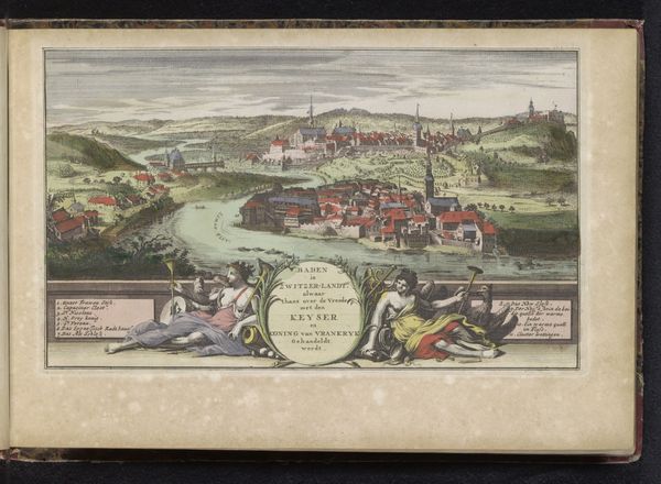
Curator: I’m struck by the jewel-like quality of this image. The fine lines, delicate colors... It feels very precious. Editor: That’s a good way to describe "Gezicht op Genève," a print dating back to 1735. The medium itself, likely a combination of watercolor and coloured pencil over a foundational print layer, tells us much about artistic production at that time, a blend of mechanical reproduction and hand finishing. Curator: And look how they've depicted Geneva! It's both idealized and informative, presenting the city as a center of trade and power, but I’m interested in the social implications behind choosing a cityscape like this, especially for distribution as a print. Editor: Indeed, consider that a cityscape view, readily multiplied and sold, shapes the viewers understanding of the city. There’s labor involved at every level here from papermaking and pigment mixing to etching the printing plate and coloring each individual print. It makes me think about what kinds of workshops were active and what roles artisans would have played within them. Curator: Absolutely. Think of the political implications too. Cityscapes are not passive landscapes; they serve as projections of civic pride, or even colonial power, don't they? What kind of patron might have commissioned this print? I wonder if its existence contributed to a collective imagination about Geneva's role as a place of reformed values? Editor: Perhaps a local merchant class seeking to bolster civic identity. Now, if you consider the Baroque style... what does its emphasis on ornate detail suggest to you? Curator: To me, it amplifies the grandeur and importance that would influence someone's feelings towards Geneva, of course. It makes it seem important to know, in a similar way how maps also shape territories and identities. But what do you take from the materials used here? I am not entirely convinced about their choices for watercolor when compared with the paper selected. Editor: I believe there's a tension in combining artisanal production techniques with this burgeoning print culture, showing this movement and push towards modernity at the same time. I think the materiality of prints in general can make one more mindful of art's status as both aesthetic object and commodity. Curator: I see that, yes. So much information to consider—who made this, why, and for whom? That layered approach truly enriches our understanding of early eighteenth-century Geneva and the people who visualized it. Editor: Precisely, by exploring how this print came into being and considering who may have interacted with it, we see art is always a form of labor, culture, and ultimately, politics.
Comments
No comments
Be the first to comment and join the conversation on the ultimate creative platform.
More like this