print, plein-air, watercolor
# print
#
plein-air
#
landscape
#
figuration
#
watercolor
#
genre-painting
#
watercolor
Copyright: Public domain
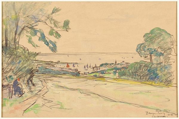
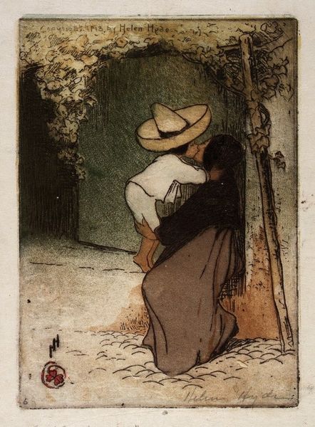
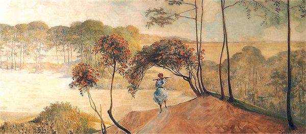
Editor: This is "Dutch Girl in Landscape" by Kanae Yamamoto, a watercolor print showcasing a figure outdoors. There's a naive, almost dreamlike quality to it, enhanced by the use of muted colors and stark lines. What's your take on the work? Curator: Structurally, I'm intrigued by the composition. Note the flattened perspective and how the artist uses line to define form, rather than relying on shading or chiaroscuro. The division of the picture plane into distinct horizontal bands – the foreground, the water, the hills – creates a sense of spatial ambiguity, challenging traditional notions of depth. How does this linearity influence your understanding of the artwork? Editor: I think it makes it seem less realistic, almost stylized, which adds to the dreamlike feel I mentioned. The flatness keeps pulling my eye back to the surface of the print, rather than letting me get lost in the scene. Curator: Precisely. Observe also the limited color palette, primarily greens and browns, unified with the light blue tones that bleed together into a muted effect. The simplification of color emphasizes the geometric forms of the landscape and the figure, contributing to the work's overall abstract quality. Are you attuned to any sort of rhythm the artwork presents? Editor: Hmm, I see repetition in the line work – in the foreground vegetation and in the trees. It’s a kind of visual pulse. Curator: Indeed. Kanae's print reduces the human form to almost an echo within the wider landscape; an exercise of contrasting and unifying both medium and motif. We find our eyes focusing not on emotion, but material and presentation, the crux of our analysis here today. Editor: I never considered just how impactful such a reduced and structured composition can be. Now I’m not just looking at the Dutch girl, I am analysing the relationship between color, line, and form. Thanks!
Comments
No comments
Be the first to comment and join the conversation on the ultimate creative platform.
