Dimensions: height 339 mm, width 250 mm
Copyright: Rijks Museum: Open Domain
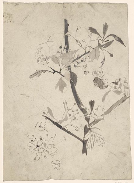
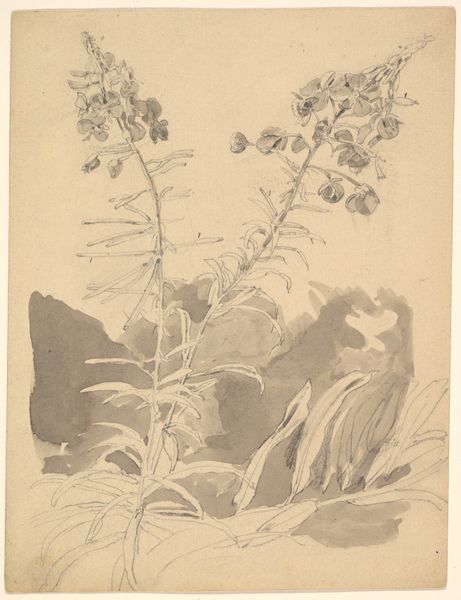
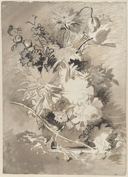
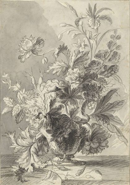
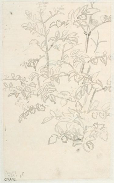
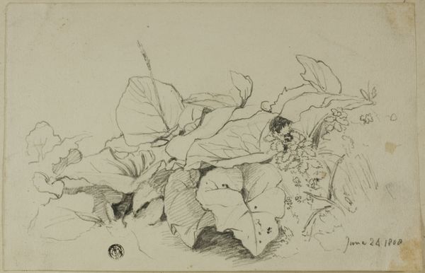
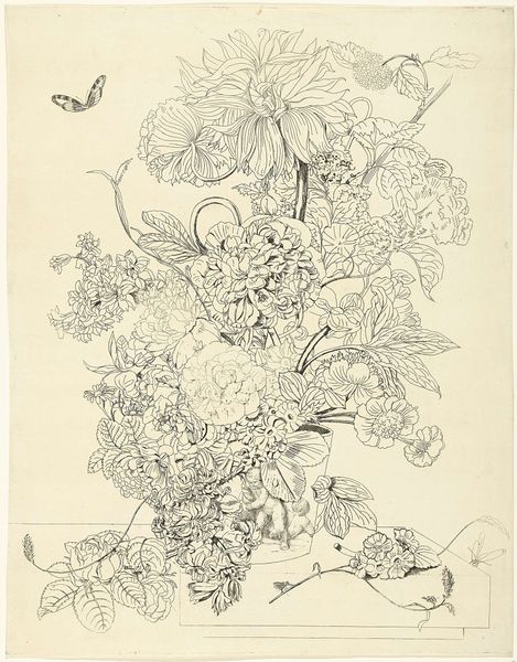
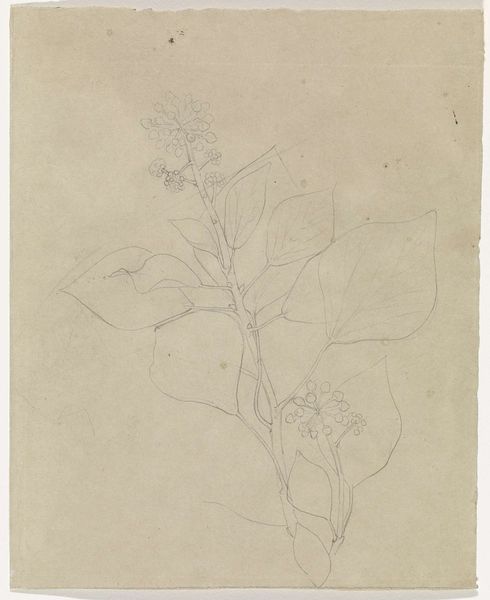
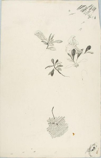
Editor: We’re looking at “Studies of Plants,” created by Carel Adolph Lion Cachet, sometime between 1874 and 1945. It’s rendered in ink on paper and housed at the Rijksmuseum. I find it quite striking how the artist uses stark contrasts to bring certain forms forward, while others fade into the background. What do you see in this piece? Curator: Formally, the work presents a fascinating study in tonal variation and line quality. Note the strategic deployment of light and shadow. The artist utilizes a restricted palette of monochrome tones to generate a layered composition. This serves to direct the viewer's eye through the image, from the delicate outlines in the foreground to the more substantial, shaded forms that seem to recede into the pictorial space. Observe, too, how the differing weights of the ink lines create a sense of depth and texture. Editor: It's interesting you mention the restricted palette. Do you think this limitation enhances the focus on the structure of the plants themselves? Curator: Precisely. By dispensing with colour, the artist obliges us to engage more intensely with the intrinsic geometry of the botanical subjects. Consider, for instance, the veins within the leaves, delineated with such careful precision. What effect does this level of detail have on you as a viewer? Editor: It makes me think about the hidden architectures within nature, the underlying structures that might otherwise be overlooked. I'd not considered this piece beyond just 'plant studies,' but now it seems there's real intention being placed into it as a conscious decision on line, shadow and weight of tone. Curator: Precisely! It highlights the pure forms and how light can interact with simple compositions. This type of analysis transcends era and makes it ever pertinent to studying works of art even today.
Comments
No comments
Be the first to comment and join the conversation on the ultimate creative platform.
More like this