Copyright: CC0 1.0
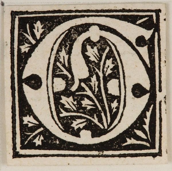
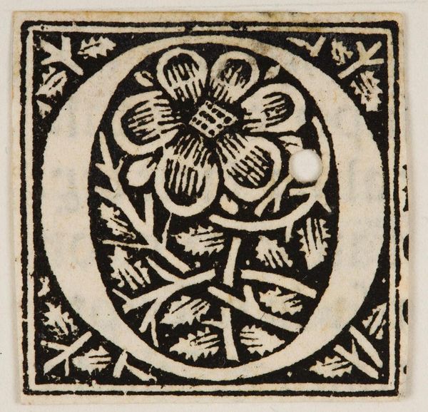
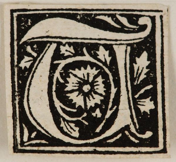
Editor: This is "Initial O" by an anonymous artist. I find its simple composition quite striking, with the stark contrast between black and white. What can you tell me about the structural elements at play here? Curator: The composition relies heavily on the interplay between positive and negative space. Notice how the floral design within the 'O' echoes its circular form, creating a visual harmony. The black background further accentuates the letter's shape, emphasizing its graphic quality. How does that symmetry impact your interpretation? Editor: It gives a sense of balance and intentionality. I hadn't thought about the echoes before. It’s fascinating how such a small piece can hold so much visual weight. Curator: Indeed. It demonstrates that careful attention to form and composition can yield a powerful artistic statement. Editor: Thank you! This was very insightful.
Comments
No comments
Be the first to comment and join the conversation on the ultimate creative platform.
More like this