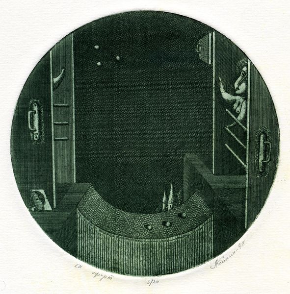
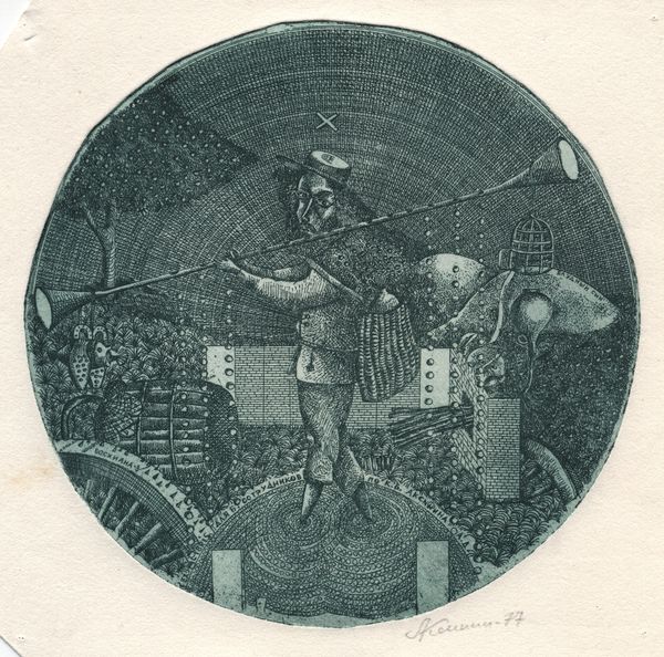
drawing, ink
#
drawing
#
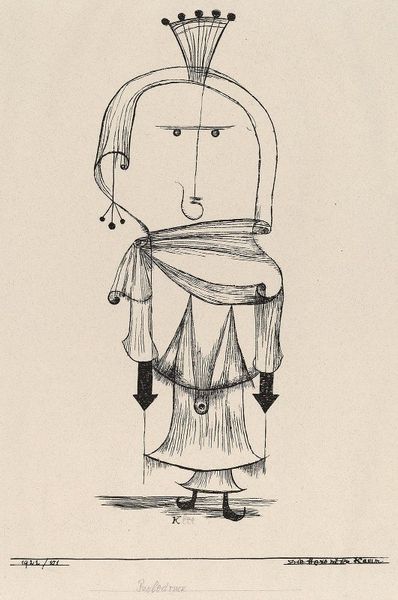
quirky illustration
#
childish illustration
#
shading to add clarity
#
old engraving style
#
figuration
#
personal sketchbook
#
ink
#
unrealistic statue
#
geometric
#
pen-ink sketch
#
limited contrast and shading
#
sketchbook drawing
#
cartoon style
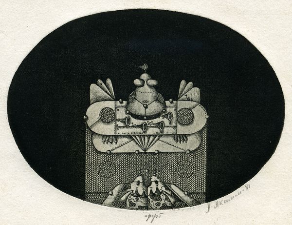
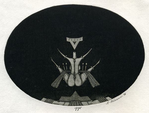
Copyright: Oleksandr Aksinin,Fair Use
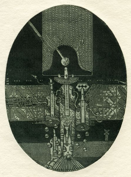
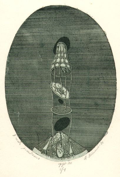
Curator: This intricate ink drawing is entitled "Exlibris G. Jan Rhebergen," created by Oleksandr Aksinin in 1981. What strikes you first about its composition? Editor: It has this slightly unsettling, yet intriguing feeling. The dark background, the peculiar figures… it gives off a surreal, theatrical vibe. Curator: Observe how Aksinin utilizes the oval format. Within it, the verticality of the composition is quite pronounced. We have stacked geometric and figural elements, creating a sense of constrained upward movement. Note, too, the stark contrast achieved with simple ink strokes. Editor: Right, the stark contrast does amplify the figures. They’re mannequin-like, almost doll-like with those ruffs, frozen in perpetual surprise. The little bird impaled on what seems like a rod. Birds have often symbolised the soul and freedom, yet here it is pinned down. Do you think this carries a darker symbolism? Curator: Potentially, and this brings in external factors that impact meaning. Symbolism, in art, is so subjective! To me the structural composition suggests balance, an arrangement of light and dark spaces, dots versus blocks... I don’t see one of Aksinin's primary aims here to invoke darker themes, although his aesthetic choices may evoke that sense for some observers. Editor: True, maybe it's less about despair, more about a playful subversion of classical motifs. The geometric shapes and figures layered on top of each other seem to mimic old scientific or alchemical illustrations. And with the bookplate function, do you think this implies anything specific about Rhebergen’s interests? Curator: I don't want to stray far beyond what is here. Instead of searching outside the piece, what do you notice about Aksinin’s meticulous linework, the balance between positive and negative space, or the deliberate choices in shading that contribute to its unique visual texture? All the forms he chooses have distinct meaning. Editor: All very true. Ultimately, the impact comes from the interplay of those carefully designed visual elements, both its structure and symbolism and how each reinforces the other. Curator: Agreed, I think that brings us to a full picture, capturing both the emotional impact and the intellectual rigour Aksinin infuses within the image.
Comments
No comments
Be the first to comment and join the conversation on the ultimate creative platform.
More like this