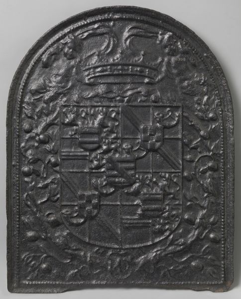
metal, relief
#
baroque
#
dutch-golden-age
#
metal
#
sculpture
#
detailed texture
#
relief
#
history-painting
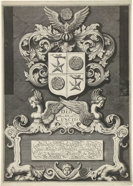
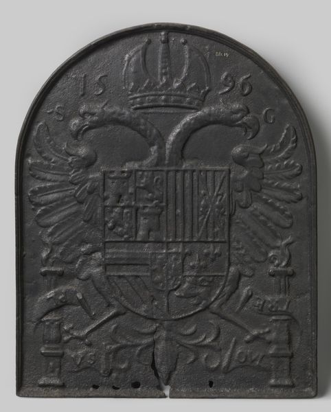
Dimensions: height 76.5 cm, width 77 cm, thickness 3.5 cm, weight 89 kg
Copyright: Rijks Museum: Open Domain
Editor: Here we have a tile panel made between 1654 and 1679, carrying the coat of arms of Johan Maurits of Nassau-Siegen. I am fascinated by the monochrome quality of it, it feels weighty and formal, despite being relatively small. What are your thoughts on the impact of the tile's materiality? Curator: The selection of metal as the medium speaks volumes. Metal’s inherent qualities, such as its durability and malleability, facilitate the creation of intricate relief. This tactile element enhances the viewer's engagement. Note the crisp lines and well-defined shapes of the arms: Crown, lions, even the scripted text. It is a deliberate compositional strategy emphasizing visual clarity and conveying a sense of authority and permanence. What do you see when you consider the layout itself? Editor: Well, the symmetry strikes me. The arms are centrally placed, flanked by what look like floral elements. Everything is very contained within the square format of the tile. Curator: Precisely. The formal, almost rigid, composition reinforces the heraldic symbolism. The arms act as a focal point, drawing the eye to its various emblematic components. Each shape has meaning, acting like signifiers, coming together in the visual construction of power and lineage. The overall aesthetic, a controlled display of wealth and prestige, relies not on ornamentation, but structural elements within the artwork itself. Does analyzing the form influence your first impressions? Editor: Yes, definitely. Focusing on its pure visual elements has removed some of my prior assumptions of context. I now appreciate its meticulous arrangement more deeply! Curator: Indeed, focusing on the construction and composition yields richer understandings, independent of contextual data, to explore its fundamental visual language.
Comments
No comments
Be the first to comment and join the conversation on the ultimate creative platform.
More like this