tempera, painting
#
portrait
#
tempera
#
painting
#
figuration
#
11_renaissance
#
oil painting
#
coloured pencil
#
history-painting
#
watercolor
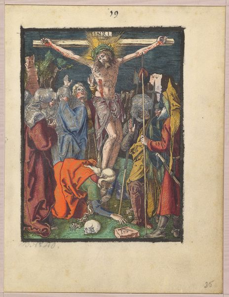
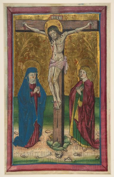
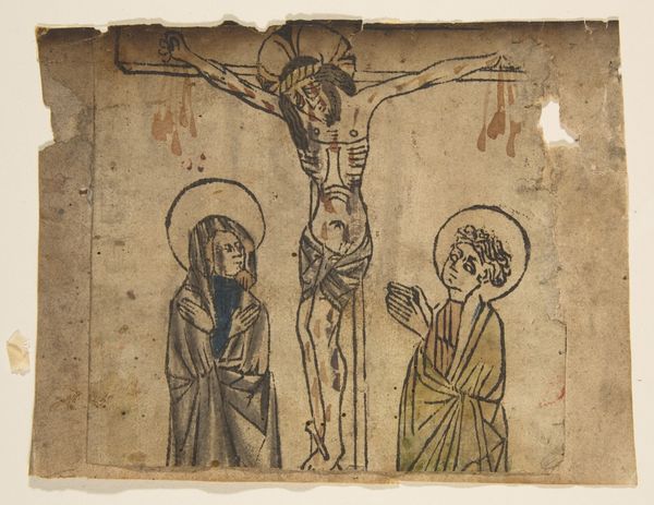
Dimensions: height 149 mm, width 105 mm
Copyright: Rijks Museum: Open Domain
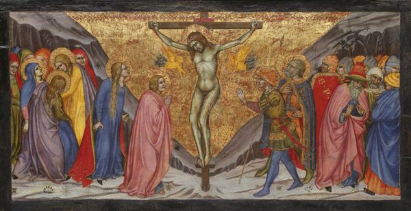
Editor: Here we have Lucas van Leyden's "Crucifixion of Christ" from 1521, housed at the Rijksmuseum. It’s a tempera painting and immediately strikes me as quite compact and detailed, with a strong contrast between the sorrowful figures on the left and the more active group on the right. How would you interpret this work through a formal lens? Curator: Formally, observe the intricate linear quality van Leyden employs. Consider the carefully balanced composition; the distribution of figures and the contrasting emotional states creates a dynamic tension. The muted colour palette reinforces the somber mood, doesn’t it? What about the use of space and depth? Editor: Yes, I noticed that the perspective seems a little flattened, almost compressed. The figures are quite close to the foreground, limiting a sense of depth. Does that choice inform the piece's overall meaning, beyond simply a technical limitation? Curator: Precisely! The restricted depth focuses our attention on the immediate scene of the crucifixion, intensifying the viewer's engagement with the event. The layering of shapes and tones guides the eye to focus centrally, doesn't it? The colour palette is a semiotic code reflecting the suffering on view. The overall geometry evokes reflection and mourning. Editor: That makes sense. Seeing it as a deliberate formal choice gives it so much more power. Thanks, I will incorporate that into the script. Curator: Of course. This is just a formal approach to a work with cultural undertones which is important to decode.
Comments
No comments
Be the first to comment and join the conversation on the ultimate creative platform.
More like this