#
aged paper
#
yellowing background
#
photo restoration
#
book
#
old engraving style
#
film poster
#
historical photography
#
old-timey
#
yellow element
#
19th century
#
golden font
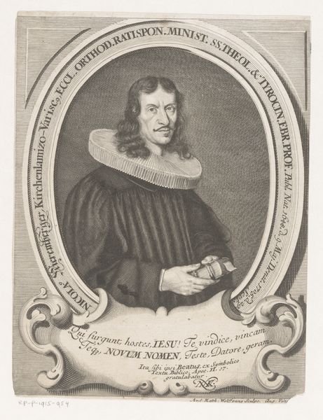
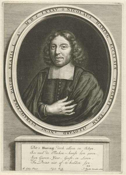
Dimensions: height 148 mm, width 101 mm
Copyright: Rijks Museum: Open Domain
Editor: So, this is "Portret van Daniel Zimmermann" by Matthias van Sommer, created in 1666. It looks like an engraving. The intricate linework creates a rather formal, almost austere mood. What catches your eye in terms of its composition? Curator: What strikes me is the artist's use of line and form. Consider the oval frame, a classical device, which immediately directs the viewer's attention to the figure. Notice how the sharp, crisp lines defining Zimmermann's face and collar contrast with the softer, more textural rendering of his sleeves. Editor: I see that now! The collar almost appears like a halo, it is quite remarkable. How does the text at the bottom play into the overall structure of the piece? Curator: Precisely. The inscription, meticulously rendered, acts as a formal anchor, balancing the portrait above. Note how the artist uses different line weights to differentiate between the title and the biographical details. The text provides critical information while enhancing the visual stability. It is also important to note the lines and geometric patterns as these aspects reinforce each other by the lines creating depth and directing the eye and that gives some texture along the frame to balance Zimmerman himself. What aspects like this stand out to you? Editor: I appreciate how you pointed out the interplay of line and texture. I was so focused on the figure that I missed the more subtle relationships between the portrait and the inscription! Curator: Observing those relationships reveals the artist's skillful manipulation of visual elements. A formal analysis like this allows us to engage with the artwork on its own terms.
Comments
No comments
Be the first to comment and join the conversation on the ultimate creative platform.
More like this