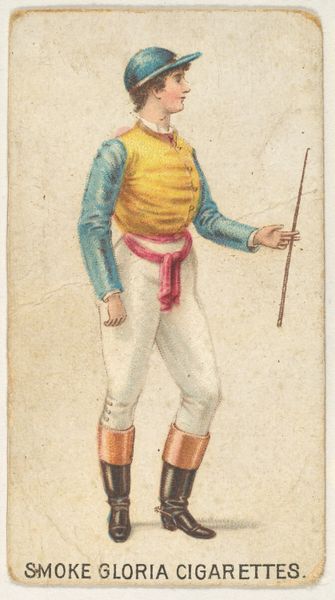
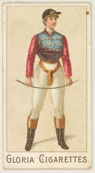
From the series "Sports Girls" (C190), issued by the American Cigarette Company, Ltd., Montreal, to promote Gloria Cigarettes 1885 - 1895
0:00
0:00
coloured-pencil, print
#
portrait
#
coloured-pencil
# print
#
caricature
#
figuration
#
coloured pencil
#
coffee painting
#
19th century
#
watercolour illustration
Dimensions: Sheet: 2 5/8 x 1 7/16 in. (6.6 x 3.7 cm)
Copyright: Public Domain
Curator: Looking at "From the series 'Sports Girls'," a colored-pencil print created between 1885 and 1895, and issued by the American Cigarette Company, the immediate impression is one of playful exaggeration. Editor: Indeed, a visual dance of curved and straight lines gives the figure a sturdy, yet fluid presence. What strikes me is the rather complex gender presentation; while presenting what society would consider female, the figure presents itself in traditionally male-coded equestrian gear, giving the impression that she may actually be nonbinary, or androgynous. The figure confidently engages the audience in a full-body shot. It's empowering, almost confrontational. Curator: Note how the color composition functions here, too. The restrained palette highlights the primary colors of the outfit: red, white, and blue against that almost beige ground of the paper itself. It lends itself to a sort of heightened contrast. It creates visual interest. The overall two-dimensionality really emphasizes flatness—typical of prints from this time. Editor: Right, that deliberate flatness serves to de-emphasize realism. But, the attire…a “sports girl” presented in late Victorian advertising? There’s a tension here, almost satirical. Consider the historical context: growing female participation in sports met resistance. So, a figure presented to advertise to potential customers suggests a disruption to societal norms, a challenge to conventional roles of women in a hyper-masculine world of business and sport. Curator: Perhaps; what you refer to is what is termed Japonisme; a fashionable design trend influenced by flat color planes, and dynamic composition stemming from Japanese Ukiyo-e prints. Here it serves to flatten depth, enhance the design and bring it back to form. Editor: And yet, the print still signifies something profound, perhaps beyond commercial intention. As much as it's trying to engage a new target demographic, doesn’t it also subtly depict women claiming agency in leisure and commerce? It's a reminder that even within promotional materials, we can find cultural moments of female empowerment. Curator: I remain fascinated by its composition— the lines, form and color planes. Editor: And I, by the narratives that those forms inadvertently help to construct and to either normalize or subvert our assumptions about gender roles within our societies.
Comments
No comments
Be the first to comment and join the conversation on the ultimate creative platform.
More like this