Curatorial notes
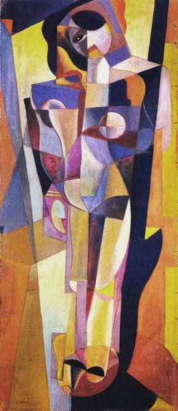
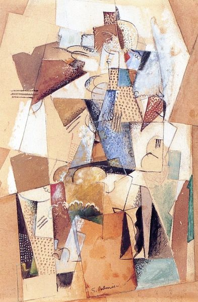
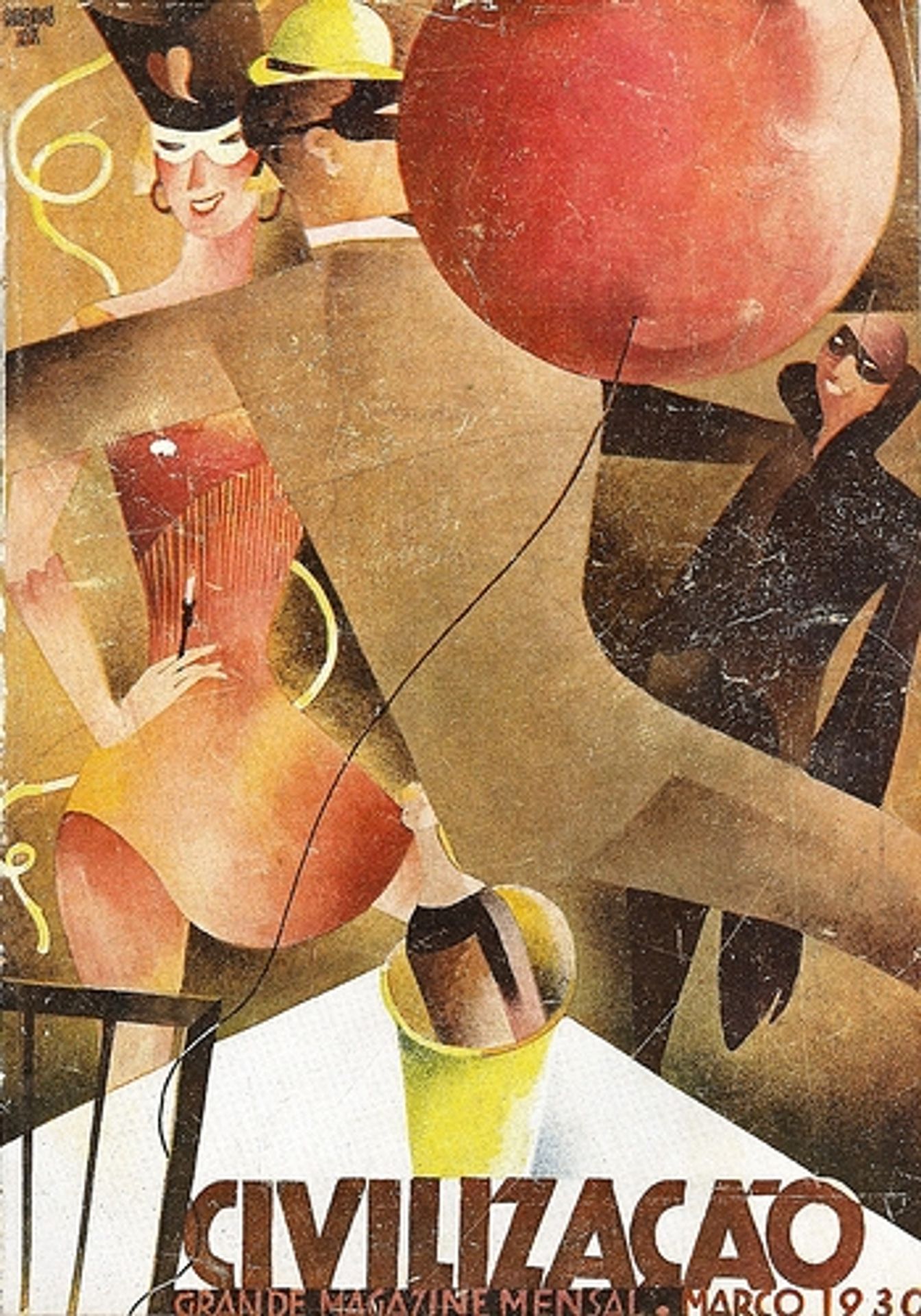
Bernardo Marques made this magazine cover, Civilização, No. 21, using a flat graphic style to conjure a sense of Jazz Age exuberance. It's all about shapes and patterns that almost collide, creating a dynamic, almost dizzying effect. Look at the way the figures are rendered: flat planes of color, sharp angles, and bold outlines. The color palette is muted, almost sepia toned, which lends a sense of nostalgia and history to the piece. The surface has a tactile quality, with the texture of the paper or printing process visible. Take the figure in the center, they're sliced and diced into geometric shapes, almost like a cubist collage. Is that a leg? A torso? It's hard to tell, but that's part of the fun. It makes me think of Hannah Höch and the photomontage of the Dadaists. Both were interested in the fragmentation of modern life, and playing with abstraction to challenge our perceptions. Marques is doing something similar here, inviting us to see the world in a new way, not as a fixed reality but as a dynamic, ever-changing construction.