drawing, textile, paper, ink
#
drawing
#
aged paper
#
homemade paper
#
script typography
#
hand drawn type
#
textile
#
personal journal design
#
paper
#
personal sketchbook
#
ink
#
hand-drawn typeface
#
thick font
#
delicate typography
#
modernism
#
small font
Dimensions: height 150 mm, width 212 mm, height 230 mm, width 315 mm
Copyright: Rijks Museum: Open Domain
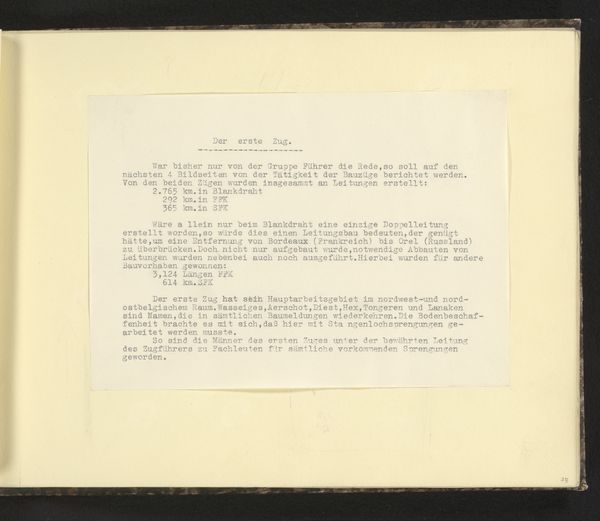
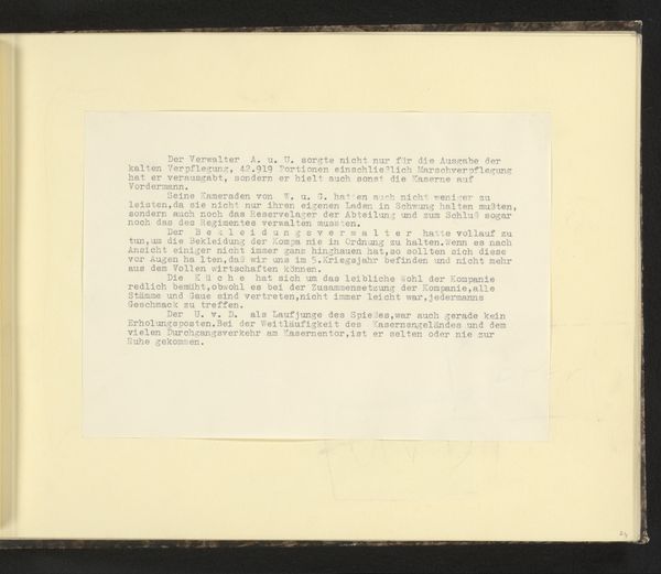
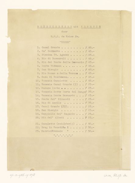
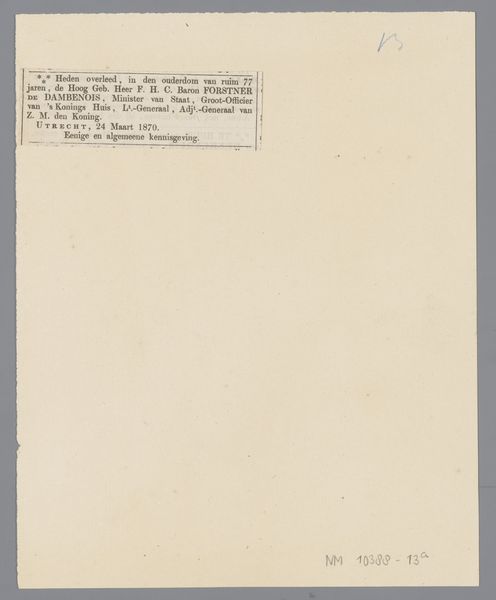
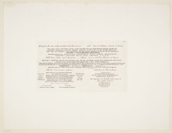
This typed page, "Tekst over de officieren", is, well, a text about officers. The anonymous artist, or perhaps documentarian, employs a pragmatic, straightforward approach. The stark contrast of the dark, mechanical typeface against the off-white paper creates a visual rhythm, a series of orderly strikes across the page. It’s like a blueprint, mapping out the hierarchy of names and titles, each carefully aligned. Think about the labor involved, the deliberate act of pressing each key, the physical engagement with the machine. There’s a certain weight to this kind of mark-making. Each letter, each word, becomes a tangible record of someone's intention. The rigidity of the typography is interesting as it emphasizes the themes of documentation, structure, and power. It reminds me a little of Ed Ruscha's word paintings, but stripped of all the color and painterly gesture. This piece offers us a chance to consider how art can emerge from the most mundane of processes, the most ordinary of materials.
Comments
No comments
Be the first to comment and join the conversation on the ultimate creative platform.
More like this