Dimensions: height 161 mm, width 239 mm
Copyright: Rijks Museum: Open Domain
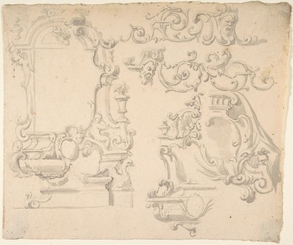
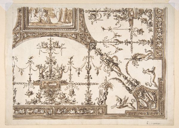
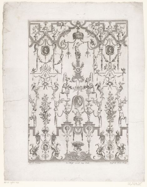
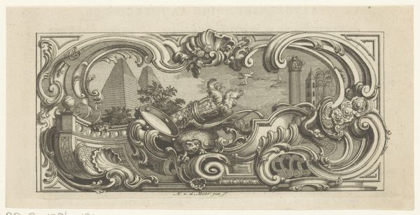
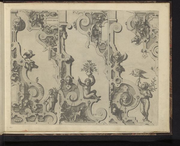
Editor: This drawing, "Twee alternatieve ontwerpen voor decoraties van een zwik" by Giacomo Quarenghi, made before 1825, uses pen and ink. The baroque ornamentation gives it an air of decadent luxury. What are some of the stories you see unfolding in this design? Curator: This drawing offers insight into the power dynamics inherent in classical representation. Notice how allegory is employed – these aren't just decorations; they are loaded with symbolism meant to legitimize authority. The classical figures, putti, and even the architectural elements all speak to a desire for order, control, and a very specific narrative about power, wouldn't you agree? Editor: Definitely. The precision in the ink drawing and the carefully posed figures convey authority. But who exactly was this design meant for? Curator: Excellent question! Consider the time period. Pre-1825 puts us in a context of shifting political landscapes. These kinds of decorative programs were often commissioned by elites—aristocrats or emerging bourgeois families—to visually reinforce their status and aspirations. Think about it: what messages are they trying to communicate through this carefully constructed imagery? Who are they trying to emulate? Editor: So, the classical style is not just an aesthetic choice, but a statement of power and legitimacy? A visual branding exercise? Curator: Precisely! It’s a carefully curated projection, using historical and mythical tropes to establish a sense of permanence and dominance in a world of rapid change. Editor: That's really changed how I see it. It's much more deliberate and political than I first thought. Thanks! Curator: And thank you. By considering the socio-political backdrop, we've unveiled the layered meanings embedded within the artwork, demonstrating that it's far more than mere decoration.
Comments
No comments
Be the first to comment and join the conversation on the ultimate creative platform.
More like this