drawing, pen
portrait
pencil drawn
drawing
amateur sketch
neoclacissism
toned paper
light pencil work
pencil sketch
charcoal drawing
portrait reference
pencil drawing
pen
portrait drawing
pencil work
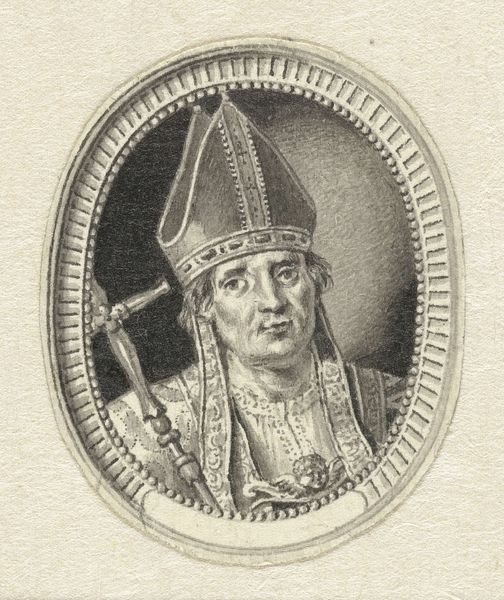
Dimensions: height 70 mm, width 51 mm
Copyright: Rijks Museum: Open Domain
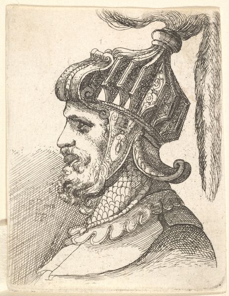
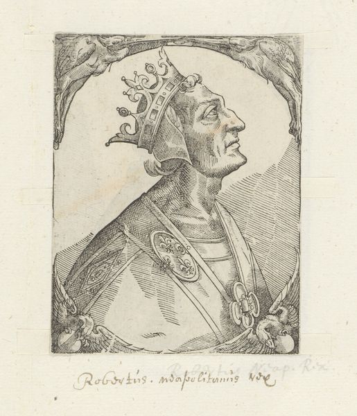
Editor: Here we have Jacques Kuyper's "Portret van de heilige Bonifatius," a pen and pencil drawing from 1783. It strikes me as quite formal, perhaps even a little stiff, and the oval composition further emphasizes this feeling. What can you tell me about how the artist has approached the formal elements in this portrait? Curator: Indeed. Notice the careful delineation of the mitre, with its intricate layering achieved through meticulous pen work. The hatching, too, employed to create the oval frame around the figure. It creates an illusion, one might even suggest an elaborate graphic language denoting hierarchy and reverence through structured visual cues. The use of line, consider how the varying pressure affects the weight, guiding the eye to important details. Editor: I see what you mean about the hatching creating a distinct backdrop. Do you think that level of precision adds to the artwork? Curator: Precision is paramount, the almost scientific quality of the lines and patterns works to remove extraneous narrative, and instead centers our reading on how the object exists in a formal setting, how it projects the values associated with it. Kuyper invites us to see how meaning is constructed, piece by piece, through visual syntax. Editor: That’s fascinating. I never considered it that way. Thank you for shedding light on it. Curator: You're welcome. Examining an artwork solely by its formal qualities opens the way for understanding and appreciation.
Comments
No comments
Be the first to comment and join the conversation on the ultimate creative platform.