print, engraving
#
portrait
#
baroque
# print
#
old engraving style
#
engraving
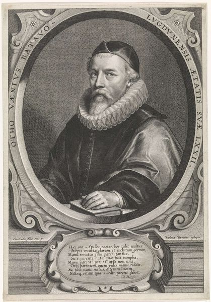
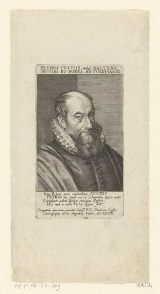
Dimensions: height 187 mm, width 140 mm
Copyright: Rijks Museum: Open Domain
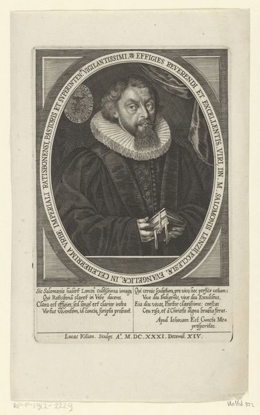
Editor: Here we have Nicolas de Larmessin’s "Portret van Otto van Veen," made in 1682. It’s an engraving on paper, held at the Rijksmuseum. The detail is incredible! What strikes me is the sharp contrast and the almost academic feel. What do you see in this piece? Curator: Formally, observe the artist's masterful use of line. The dense, parallel hatching creates depth and volume, particularly in the sitter's face and elaborate ruff. Note how the contrasting areas of light and dark—the stark white collar against the shadowed robe—draw the eye and create a visual rhythm. Do you notice how the inscription interacts with the image itself? Editor: Yes! The lettering feels very much part of the overall composition, almost like another texture. Curator: Precisely. And the carefully arranged text, coupled with the figure's direct gaze, imparts a sense of learnedness. The portrait transcends simple representation; it’s a carefully constructed image meant to convey intellectual gravitas. Notice the linear patterns are repeated and emphasize a certain texture on the portrait itself. Editor: That's a fresh perspective! I was caught up in the face and expression, and didn't consider how the print itself created meaning through line and light. It seems very intentional. Curator: Indeed. The visual syntax speaks volumes. Editor: I learned a lot from this exercise; there's so much more here than first meets the eye. Curator: Agreed. Approaching a portrait this way unveils layers of meaning encoded in its visual language.
Comments
No comments
Be the first to comment and join the conversation on the ultimate creative platform.
More like this