graphic-art, print, typography, engraving
#
graphic-art
#
script typography
#
hand-lettering
#
dutch-golden-age
# print
#
hand drawn type
#
hand lettering
#
typography
#
hand-drawn typeface
#
fading type
#
stylized text
#
thick font
#
handwritten font
#
engraving
#
small lettering
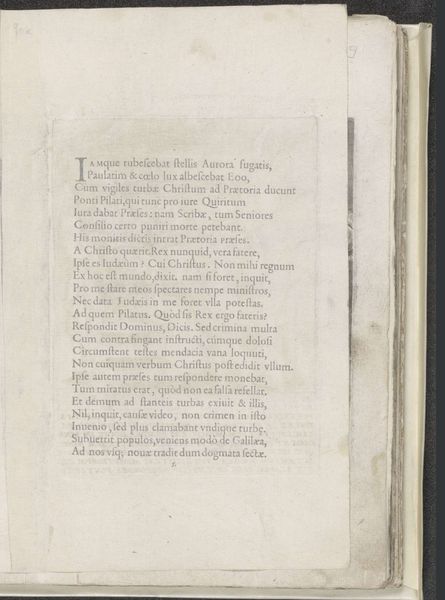
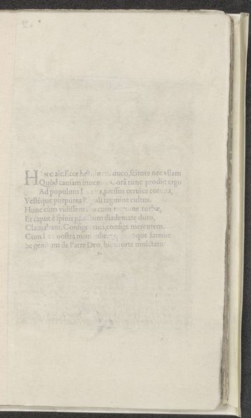
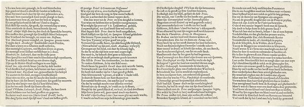
Dimensions: height 206 mm, width 79 mm
Copyright: Rijks Museum: Open Domain
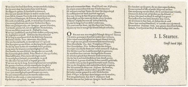
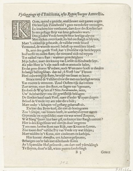
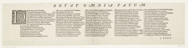
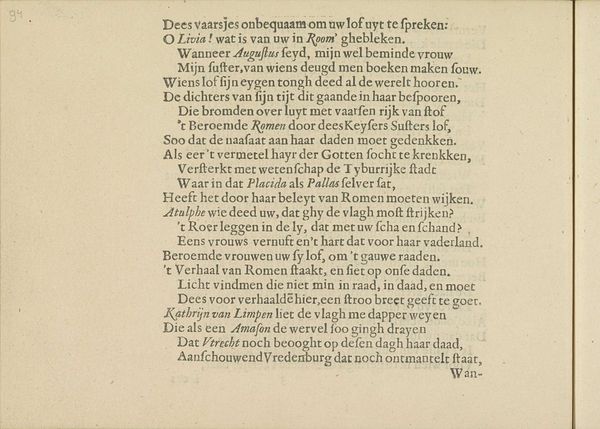
Editor: This is "Blad met vers ter ere van Bathasar Bort," made sometime between 1662 and 1670. It's an engraving, so a print, featuring elaborate typography and lettering. I’m struck by the density of the text and the way the font seems to both fade and boldly present itself. What can you tell me about it? Curator: Well, looking at this from a historical perspective, this piece offers a fascinating window into the intersection of power, language, and Dutch colonial ambition in the 17th century. This broadside, seemingly printed to honor Balthasar Bort, Governor of Malacca, isn't simply a tribute; it's a carefully crafted piece of political messaging. Editor: Political messaging? How so? Curator: Consider the context. Malacca was a crucial strategic and economic hub for the Dutch East India Company. Commemorating Bort in this way served to solidify Dutch authority and legitimize their presence in the region. The typography itself, with its mix of formal script and bold pronouncements, evokes a sense of officialdom and importance. Editor: So, it's about more than just praising an individual? Curator: Exactly. The elaborate verses would likely resonate with an educated elite. Who would be seeing this broadside? It speaks volumes about the intended audience. It reinforces Dutch cultural values and portrays their governance as divinely ordained and beneficial to the local population, regardless of whether that perception matches reality. Editor: That’s insightful. I hadn't considered how the act of printing and distributing something like this could be such a powerful political tool. Curator: Indeed. By analyzing the artwork's function within its socio-political context, we can gain a deeper understanding of its historical significance. We need to ask what impact this would have in the region and what statement the artist was intending to convey about the governor and the Dutch power. Editor: It’s fascinating to think about how art can be used to shape perceptions of power and legitimacy. This definitely makes me look at typography in a whole new way!
Comments
No comments
Be the first to comment and join the conversation on the ultimate creative platform.
More like this