drawing, ink
#
drawing
#
cubism
#
constructivism
#
ink
#
geometric
#
abstraction
#
russian-avant-garde
#
futurism
Copyright: Public domain
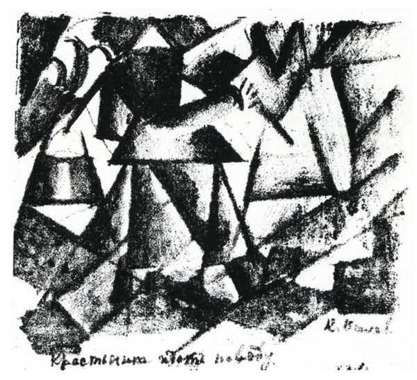
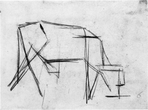
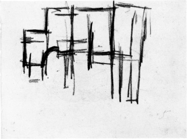
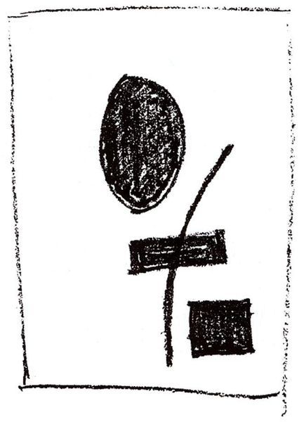
This drawing called Home, by Kazimir Malevich, looks like it was dashed off with ink, maybe a ballpoint, on a scrap of paper. I love the way he's not precious with the materials. It's like he's thinking out loud. The shapes are all blocky and geometric but somehow they still feel cozy, you know? There's a push and pull between abstraction and representation. Look at the way he uses these dark, solid shapes next to these little details, like the suggestion of a window or a ladder. It's a really compressed, almost diagrammatic way of suggesting architecture. I can imagine him squinting, trying to boil down the essence of “home” into these bare essentials. I keep thinking of someone like Philip Guston when I look at Malevich. Both of them were able to be really direct and honest in their work, and unafraid to just put it all out there, warts and all. It’s this embrace of imperfection and the raw, unfinished quality that makes the piece so compelling, don't you think?
Comments
No comments
Be the first to comment and join the conversation on the ultimate creative platform.
More like this