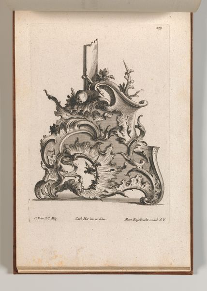
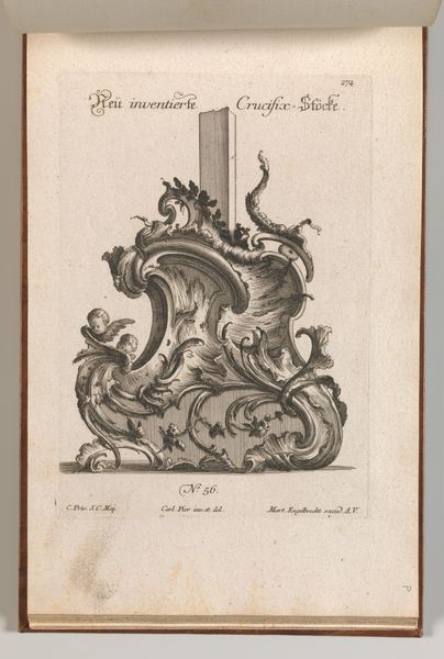
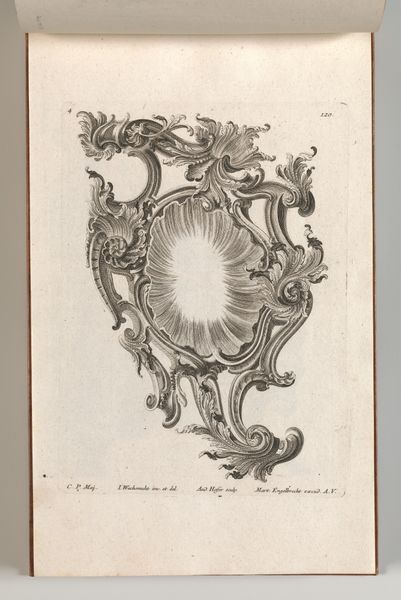
Design for the Base of a Crucifix, Plate 4 from: 'Neü inventierte Crucifix= Stöcke' 1745 - 1755
drawing, print, engraving
drawing
baroque
form
line
engraving
Dimensions: Overall: 8 7/16 × 13 3/4 in. (21.5 × 35 cm)
Copyright: Public Domain
Editor: This is a plate titled "Design for the Base of a Crucifix," dating from between 1745 and 1755, by Jacob Gottlieb Thelot. It’s an engraving, currently held at the Met. I'm immediately struck by the intricacy of the linework and the almost overwhelming detail. It's beautiful, but also feels a little… chaotic? How do you interpret this work? Curator: Chaos, perhaps, but also control. Observe how the elaborate ornamentation, seemingly unrestrained, is nevertheless structured by the underlying geometry of the base itself. The volutes, the vegetal motifs—all are meticulously rendered and contained within a defined form. Editor: So, the ornamentation is almost a kind of language in itself? Like a series of visual statements? Curator: Precisely. Think of semiotics: these motifs act as signs, communicating values of opulence and grandeur, hallmarks of the Baroque aesthetic. Note the strategic deployment of light and shadow, achieved through varied line weights. How does that contribute to the overall effect? Editor: It creates a sense of depth and drama, right? Almost like a stage set. The darker areas emphasize the lighter, more ornate sections. It also reinforces the three-dimensionality of what is, after all, a two-dimensional image. Curator: An excellent observation. Consider too how the artist uses line to create texture. We can almost feel the coolness of the metal, the suppleness of the leaves. The interplay of these tactile sensations engages the viewer on a deeper level. It is line as both structure and surface. What is the symbolic value of such form? Editor: It’s all so calculated and precise, even though it looks free-flowing at first glance. Curator: Indeed. This design transcends mere decoration; it’s a testament to the power of line, form and structure as means of communication. Editor: I never thought about an engraving having such complex architecture. Curator: Analyzing art from this perspective unveils intricacies and strategies we often overlook, broadening our appreciation.
Comments
No comments
Be the first to comment and join the conversation on the ultimate creative platform.