metal, engraving
#
baroque
#
metal
#
old engraving style
#
history-painting
#
engraving
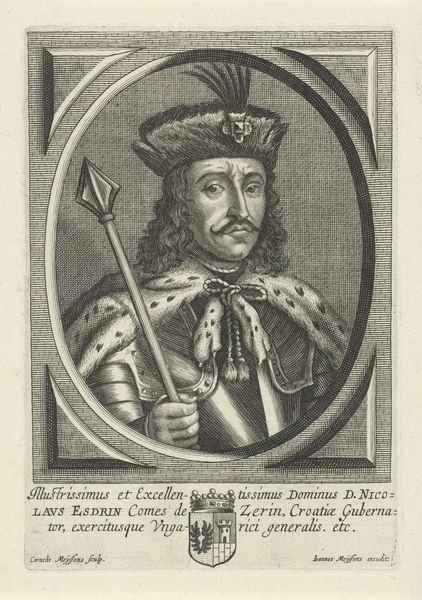
Dimensions: height 224 mm, width 155 mm
Copyright: Rijks Museum: Open Domain
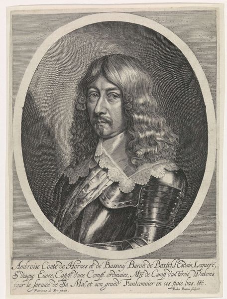
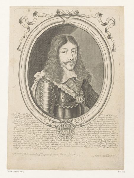
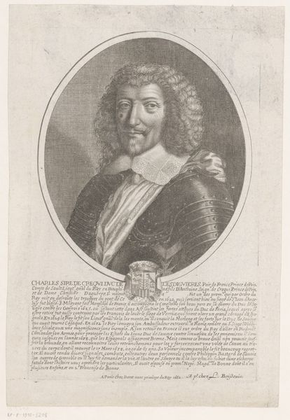
Editor: Here we have Johann Alexander Böner's "Portret van Henri, duc de Guadagne," created in 1674. It's an engraving on metal, and the detail is quite striking. It seems like such a formal, almost stoic depiction. What do you see in the work, from a purely formal perspective? Curator: Immediately, the sharp contrasts within the monochrome field command attention. Consider the textures: the meticulously rendered, flowing hair against the rigid, reflective armour. It’s a study in opposing visual languages, isn't it? Böner skillfully uses line and shadow to define form, creating a tension between surface and depth. The oval frame further isolates and elevates the figure, directing our gaze. Editor: I hadn't thought about the frame's effect that way. Is the inscription also important to the work’s formal qualities? Curator: Certainly. Its placement isn't merely informative; it anchors the composition. The carefully chosen lettering, aligned to emphasize structure, adds another layer to the overall design. Böner is consciously constructing an image designed to evoke a sense of presence. Does the execution align with the Baroque sensibilities in your view? Editor: Definitely! It strikes me as very Baroque now that you mention it. Thank you for pointing out the contrasts. I tend to miss things at first glance. Curator: Formal analysis sharpens perception. Examining art in terms of its inherent visual components allows access beyond cultural background. I appreciate this reminder of Baroque engraving, and how texture adds depth.
Comments
No comments
Be the first to comment and join the conversation on the ultimate creative platform.
More like this