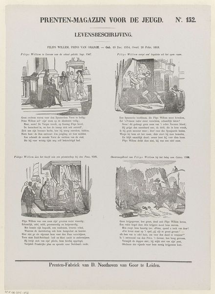
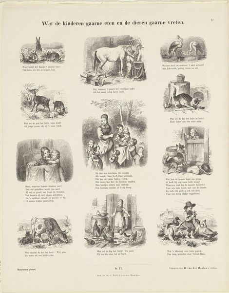
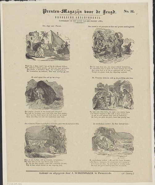
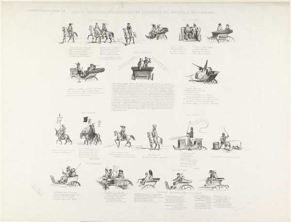
print, engraving
#
comic strip sketch
#
quirky sketch
#
narrative-art
# print
#
old engraving style
#
sketch book
#
personal sketchbook
#
idea generation sketch
#
sketchwork
#
comic
#
sketchbook drawing
#
genre-painting
#
storyboard and sketchbook work
#
sketchbook art
#
engraving
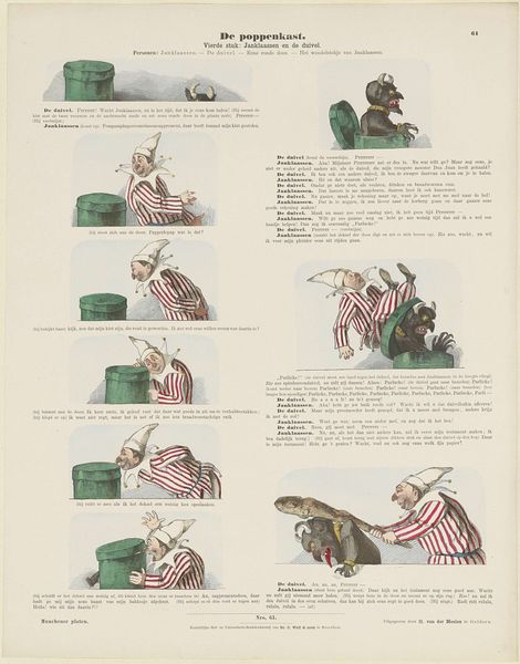
Dimensions: height 441 mm, width 346 mm
Copyright: Rijks Museum: Open Domain
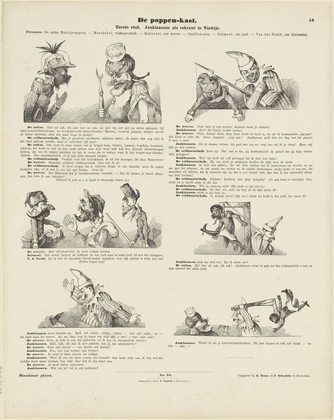
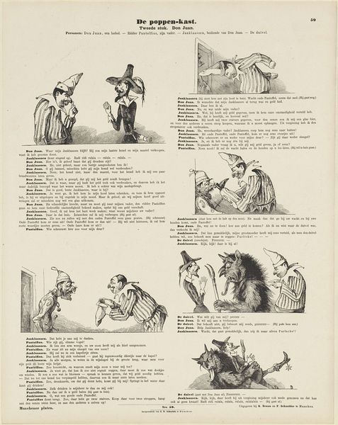
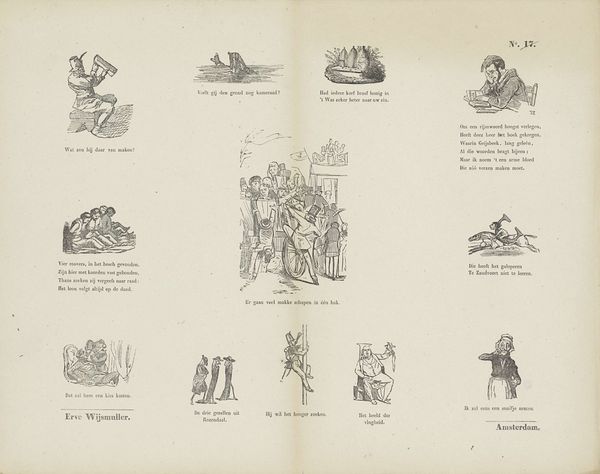
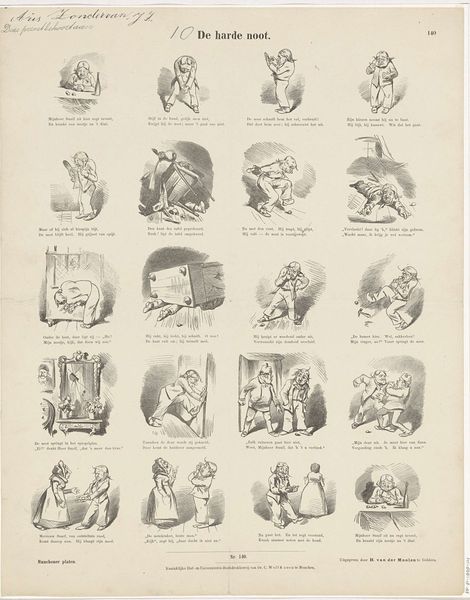
Editor: So, here we have “De poppen-kast / Vierde stuk: Janklaassen en de duivel,” created sometime between 1843 and 1920 by C. Reinhardt. It looks like an engraving, a printed comic strip. The stark black lines give it a theatrical feel, fitting for a puppet show narrative, and the characters’ exaggerated poses are rather comical. How would you interpret this work focusing on its formal aspects? Curator: From a formalist perspective, the stark contrast and tightly controlled lines create a dramatic visual rhythm across the page. Notice how Reinhardt uses hatching and cross-hatching to build tonal variation and suggest volume, particularly in the figures of Janklaassen and the Devil. This isn't simply illustrative; it establishes a visual hierarchy. Consider how the repetition of geometric shapes – the circles of the puppets’ heads, the box, the text blocks – creates a unifying structure. Editor: Yes, I see how that geometric structure really pulls it together. It is like a proto-graphic novel or storyboard, the balance of figures with the panels makes sense to the eye. Are the text blocks part of the formal composition, too? Curator: Absolutely. The text, although primarily narrative, functions visually as blocks of dark and light, counterbalancing the figural elements. Think about the negative space as well—how it carves out and defines the shapes. Reinhardt is consciously manipulating visual elements. It guides our eye across the page. How does that make you consider the work’s overall impact? Editor: Well, seeing it that way makes me appreciate how much thought went into the composition, even within what seems like a simple comic strip. I was drawn in by the quirky, slightly unnerving expressions, and how dynamic each tableau is. Curator: Precisely. Formalism directs us to examine how an artist's decisions regarding form—line, shape, space, texture, and color—impact the viewer’s experience. Editor: I get it. Looking at the work through the lens of its composition shows a totally new layer of artistry, and the strategic arrangements on the page. Thanks!
Comments
No comments
Be the first to comment and join the conversation on the ultimate creative platform.
More like this