print, engraving
#
narrative-art
# print
#
old engraving style
#
genre-painting
#
engraving
Dimensions: height 416 mm, width 298 mm
Copyright: Rijks Museum: Open Domain
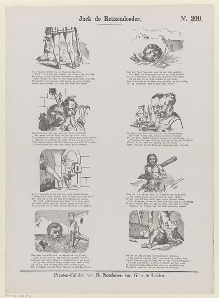
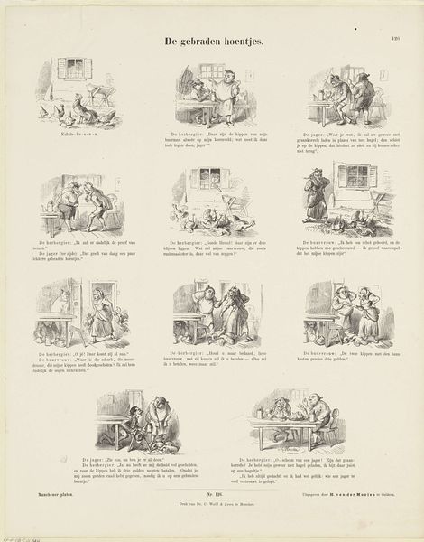
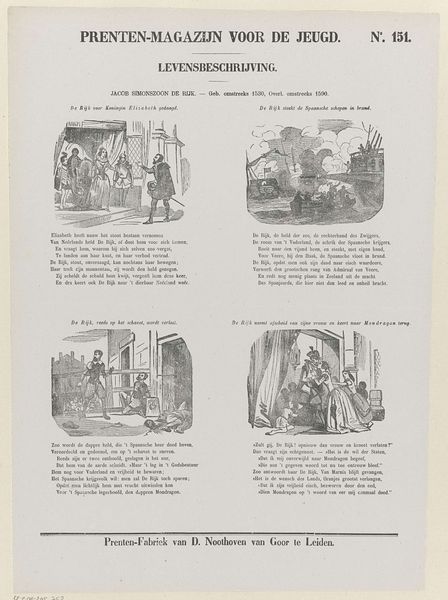
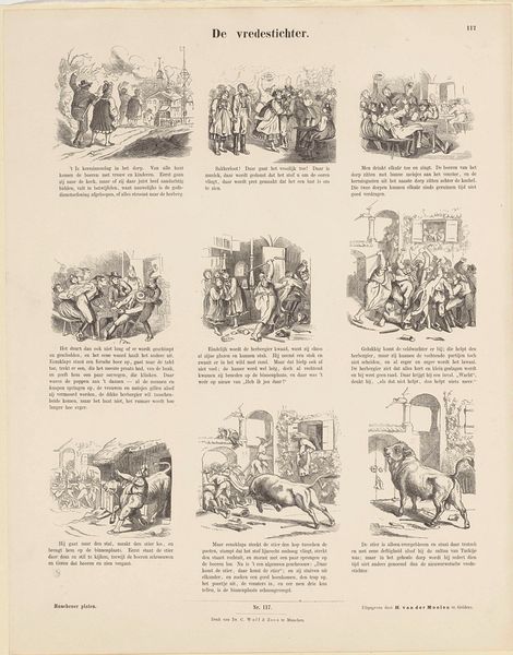
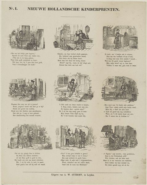
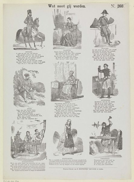
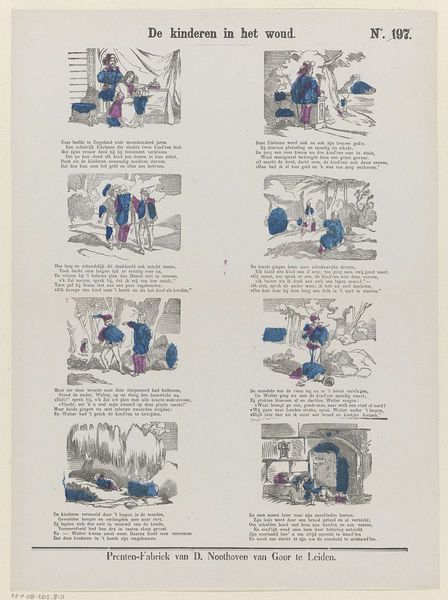
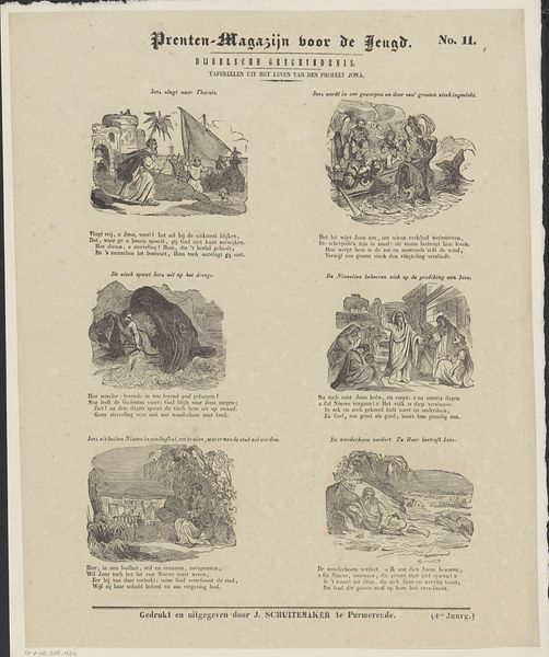
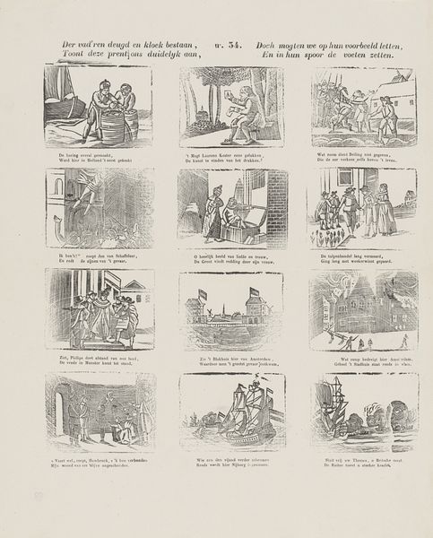
Editor: We're looking at "Whittington en zijne kat," created between 1850 and 1881, a print by Dirk Noothoven van Goor. The layout is quite unique; it's a grid of scenes accompanied by Dutch text, almost like a comic strip. The engraving style is interesting too. How would you interpret the composition of these sequential images? Curator: The division into discrete panels certainly commands attention, inviting analysis. Let us observe the rigorous geometry: Each frame presents a miniature stage, yet the aggregate lacks a cohesive center. Does this fragmentation enhance or diminish the narrative's legibility for the viewer? Consider also the interplay between image and text – is it complementary, supplementary, or perhaps even dissonant? Editor: I see your point. I find it hard to discern a narrative flow visually. Are there ways to read each block as an independent composition and consider the negative spaces between the images as an intended visual element, or would that be stretching it? Curator: Not necessarily. Though the content is undoubtedly representational, such structured partitioning can still function formally. The arrangement elicits comparative viewing habits, allowing one to examine the consistency – or lack thereof – of line quality, tonal range, and figure-ground relationships. Consider also that the grid in itself imposes a framework – does that offer a commentary on how stories are framed or consumed? Editor: That’s given me a lot to consider; I had been focused on the storyline initially. Examining it as an interconnected grid of images reframes the entire experience for me. Thanks! Curator: Indeed! Thinking of narrative through formal arrangement encourages closer inspection and interpretation.
Comments
No comments
Be the first to comment and join the conversation on the ultimate creative platform.
More like this