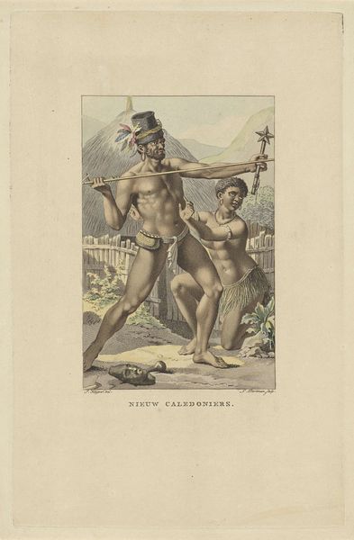
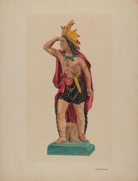
drawing, print
#
portrait
#
drawing
#
narrative-art
# print
#
watercolour illustration
#
watercolor
Dimensions: height 244 mm, width 157 mm
Copyright: Rijks Museum: Open Domain
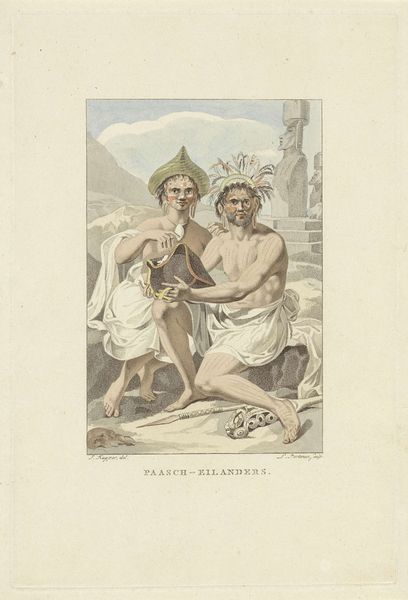
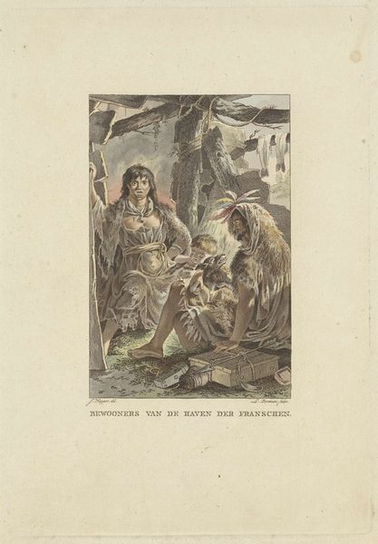
Editor: Here we have "Bewoners van de Markiezeneilanden", or "Inhabitants of the Marquesas Islands," created around 1803 by Ludwig Gottlieb Portman, employing watercolor and printmaking techniques. It has a distinctly serene feel, despite portraying figures with rather striking tattoos. How would you interpret this work purely from a visual perspective? Curator: Focusing on the formal elements, note the composition's deliberate structure. The figures are arranged in a triangular configuration, creating a stable and balanced visual field. The color palette, primarily muted earth tones punctuated by the pale flesh of the figures, generates a specific visual rhythm. Observe the lines used to define form; they are precise yet delicate, suggesting a considered approach to representation. What effect does this precision have on your reading of the artwork? Editor: It gives the image a feeling of controlled observation, I guess? It makes me think of early scientific illustrations. Is there something to the marks on their skin that adds to that effect? Curator: Exactly! The detailed rendering of the tattoos, considered as pure visual texture, adds to the overall complexity of the design. We also see a strategic deployment of light and shadow used to enhance depth and volume, especially in the depiction of the figures' musculature. How does the artist’s formal rendering affect the viewer's perception of these island inhabitants? Editor: It definitely pulls the viewer in to scrutinize them closely. I appreciate seeing how so much detail in the lines and shapes can influence your feelings about a work. Curator: Indeed. Through careful orchestration of color, line, and composition, Portman has produced a visually arresting tableau which allows a nuanced appreciation of the graphic impact. Editor: I agree, paying closer attention to the technical execution highlights interesting compositional effects.
Comments
No comments
Be the first to comment and join the conversation on the ultimate creative platform.
More like this