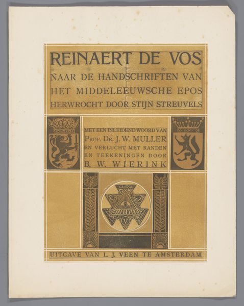
graphic-art, print, typography, poster
#
graphic-art
#
art-nouveau
# print
#
typography
#
poster
Dimensions: height 192 mm, width 128 mm
Copyright: Rijks Museum: Open Domain
This is Bernard Willem Wierink's 'Vignet voor uitgever J.W. Muller', made with an unknown medium. Immediately striking is the simple palette, dominated by a terracotta tone against a cream background. The geometric arrangement and the contrasting shades add depth and graphic clarity to the piece. Wierink's composition relies on strong vertical and horizontal lines, providing balance. However, the implied narrative destabilizes this harmony. The fox, encircled by a sun-like burst of spikes, sits above the publisher's name, suggesting a hierarchy or a symbolic association. The stylized plants on either side of the fox are ambiguous. Taken together, these elements function semiotically. The fox image embodies cunning and cleverness, while the publisher's information conveys authority. This combination can be read as a comment on the power dynamics inherent in publishing. The artwork's design emphasizes flat shapes and bold outlines. This use of form over realism is less about representing the world, and more about communicating ideas about knowledge and power. Like any strong piece of art, the Vignet continues to invite new ways of seeing and understanding.
Comments
No comments
Be the first to comment and join the conversation on the ultimate creative platform.
More like this