I monumenti sepolcrali scoperti nei mesi di maggio, giugno e luglio 1863 presso la Chiesa della Santa Trinità in Atene 1863
0:00
0:00
graphic-art, print, typography
#
graphic-art
#
aged paper
#
homemade paper
# print
#
sketch book
#
hand drawn type
#
personal sketchbook
#
typography
#
hand-drawn typeface
#
ink colored
#
thick font
#
sketchbook drawing
#
italian-renaissance
#
sketchbook art
Dimensions: height 360 mm, width 245 mm, thickness 10 mm
Copyright: Rijks Museum: Open Domain
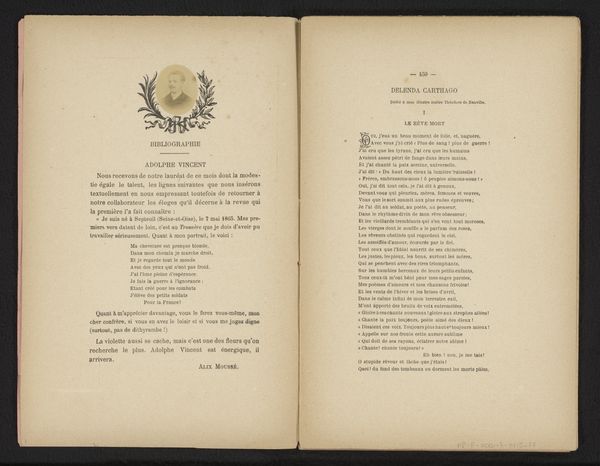
Editor: This is Ambrogio Seveso's "I monumenti sepolcrali scoperti nei mesi di maggio, giugno e luglio 1863 presso la Chiesa della Santa Trinità in Atene," created in 1863. It's a print, almost like a page from a sketchbook. The typography really catches my eye; the variations in weight and style create an interesting texture on the page. What do you see when you look at this piece? Curator: The arrangement of textual elements is of prime interest here. Observe the hierarchy established through the font sizes and weights. "I MONUMENTI SEPOLCRALI" commands immediate attention, doesn't it? Then our eye descends to the more delicate script detailing the specifics of the discovery. Consider the empty space on the opposing page. Does it not act as a crucial visual element, providing balance and directing our focus? Editor: Absolutely. The negative space definitely highlights the density of the text. It's almost as if the composition mirrors the act of uncovering something, of revealing information bit by bit. But what about the ornamental seal near the bottom? Does that play a formal role as well? Curator: Indeed. Its symmetrical form provides a grounding element, preventing the composition from feeling too ethereal. It serves as a visual anchor, connecting the textual information above to a sense of official documentation, grounding the discoveries presented. The seal mirrors the shape of the title and acts as another point in a triangle composition. Editor: That's a fascinating perspective. I hadn't considered the seal as such a pivotal component in the overall design. Looking at how the typefaces interact, I noticed the variations create visual rhythm, especially given the use of white space and seals creating further variations. Curator: Precisely. The variations contribute to the graphic’s visual dynamism and structural stability. By observing the shapes and relationships between all of the individual elements, we get an appreciation for the artist's intent to structure and present the data. Editor: Thanks, I see the design in a new light now!
Comments
No comments
Be the first to comment and join the conversation on the ultimate creative platform.
More like this